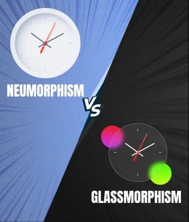
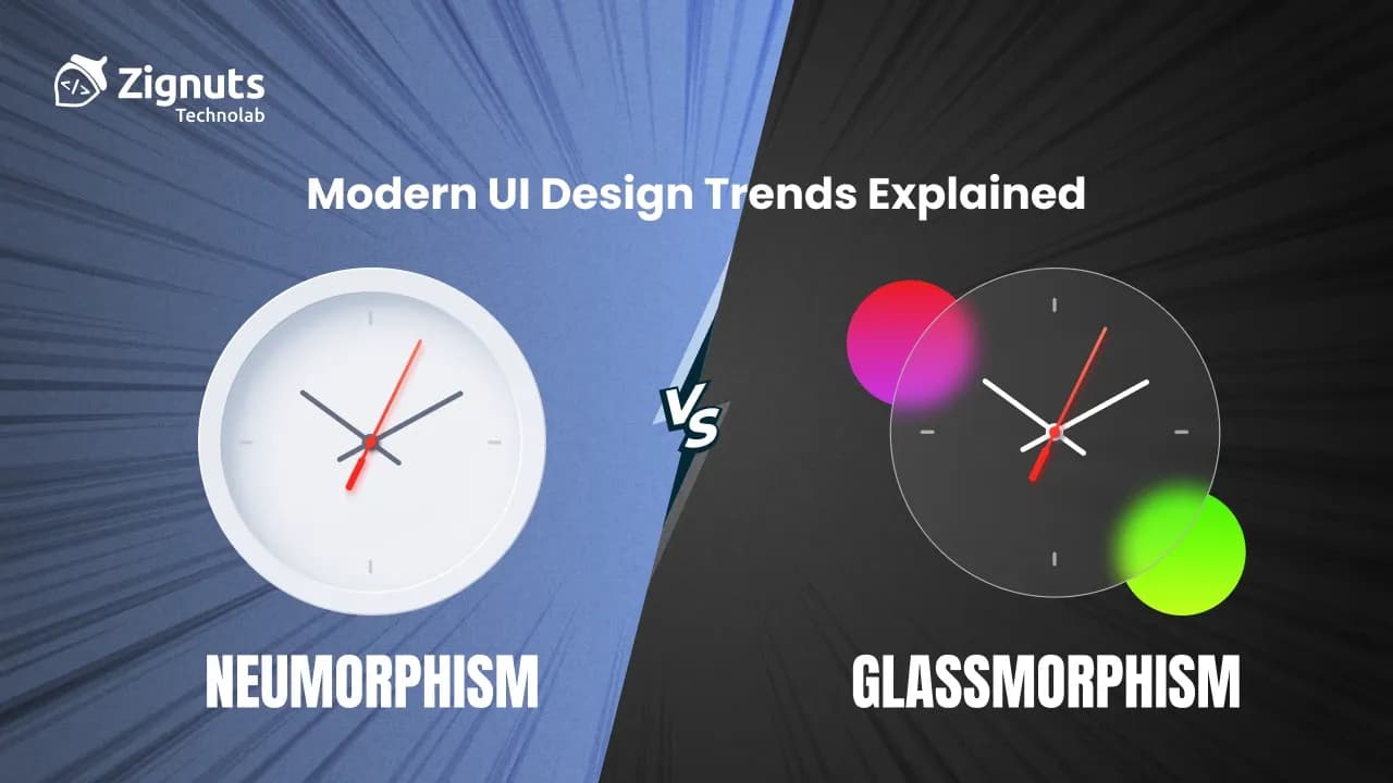
In the rapidly shifting landscape of 2026, user interface design has moved far beyond simple buttons and flat colors. Today, we are witnessing a sophisticated digital renaissance where tactile realism meets ethereal transparency. As the AI-driven era demands interfaces that feel more human and responsive, Neumorphism vs Glassmorphism has become the defining debate for creators aiming to bridge the gap between the physical and digital worlds. This exploration dives into how these aesthetics have matured, their practical implementation in high-performance apps, and how to choose the right visual language for your next big project.
The evolution of these trends reflects a deeper psychological shift in how we interact with our devices. While the early 2020s were defined by a "flat" utility, the current year favors depth and environmental awareness. Designers are no longer just choosing a style; they are crafting an atmosphere. Whether it is the soft, extruded organic feel of a Neumorphic control panel or the multi-layered, frosted elegance of a Glassmorphic dashboard, these trends utilize advanced CSS capabilities and GPU-accelerated rendering to provide instant visual feedback.
As hardware becomes more powerful, the technical limitations that once hindered these styles, such as heavy background blurs or complex shadow stacking, have vanished, allowing for seamless integration into mainstream enterprise software. Understanding the nuance between these two titans of design is essential for any developer or designer looking to build products that feel premium, accessible, and cutting-edge in today's competitive market.
Neumorphism: Neumorphism vs Glassmorphism
What is Neumorphism?
Neumorphism represents a soft, extruded evolution of the classic skeuomorphic style. Often referred to as "soft UI," it relies on a clever interplay of light and shadow to make elements look like they are molded directly out of the background surface. In 2026, this trend has shifted away from extreme shadows toward a more refined, "claymorphic" hybrid that feels incredibly tactile on high-refresh-rate displays. This modern iteration emphasizes a unified surface where the button and the background are one single sheet of material, differentiated only by subtle gradients that mimic real-world physics. It is the antithesis of the floating, layered look, focusing instead on a monolithic, integrated appearance.
Advantages of Neumorphism
- Organic Tactility: It provides a sensory experience that mimics physical materials like plastic or silicone, making digital interactions feel more grounded.
- Reduced Visual Noise: By using color palettes that match the background creates a calm, unified workspace that prevents cognitive overload.
- Intuitive Feedback: The "pressed" state of a neumorphic button is arguably the most satisfying interaction in modern CSS, providing a clear "in-out" state.
- Calm Aesthetics: It’s ideal for wellness, medical, or smart-home applications where a soothing atmosphere is required.
- Sophisticated Simplicity: It allows for a high-end look without needing complex imagery or heavy decorative assets.
- Consistency: The uniform light source used in this style creates a predictable and reliable environment for the user to explore.
- Accessibility and Contrast Hurdles:
While the "wow factor" is high, accessibility remains the primary hurdle for this aesthetic. Low-contrast ratios can make it difficult for users with visual impairments to distinguish active elements from static backgrounds. In the design standards of 2026, failing to meet WCAG contrast requirements is a significant risk that designers must mitigate through smarter shadow management.
- The "Clickability" Dilemma:
Because the elements are so subtle, buttons may not always appear interactive to every user. Without the traditional visual markers of a raised button, some users might find the interface confusing or non-responsive. This requires designers to be intentional about using hover states and micro-animations to signal functionality.
- Visual Solutions for Readability:
My recent tests show that adding a subtle 1px border or a vibrant accent color to the focal point solves most of these readability issues without breaking the soft aesthetic. These "micro-borders" provide the necessary edge definition that allows the human eye to quickly categorize a shape even when the color matches the background perfectly.
- Dark Mode Complexity:
Because this style relies heavily on shadows, it can be tricky to implement in dark mode without careful attention to shadow density and light physics. Standard black shadows often disappear against dark gray backgrounds, requiring designers to use deep indigo or charcoal tones paired with luminescent highlights to maintain the extruded effect.
- Implementation of Inner Glows:
Designers in 2026 are increasingly using "inner glows" or light-emitting strokes to ensure these elements remain visible and interactive even in low-light interface settings. This evolution helps maintain the soft look while providing a "neon-like" guide for users navigating the UI at night.
- Scaling and Responsive Constraints:
Shadows and highlights do not always scale linearly. An effect that looks perfect on a desktop monitor can appear muddy or overly sharp on a smaller mobile screen. Proper implementation requires dynamic CSS variables that adjust shadow spread and blur based on the device's pixel density and screen size.
Neumorphism Example (Code)
CSS:
HTML:
Neumorphism vs Glassmorphism: Glassmorphism
What is Glassmorphism?
If Neumorphism is about solid objects, Glassmorphism is about the space between them. It utilizes multi-layered transparency and a distinctive background blur (frosted glass effect) to create a sense of depth and hierarchy. With the power of modern GPUs, the backdrop-filter property now runs smoothly even on mid-range mobile devices, making this the go-to look for premium operating systems in 2026. This aesthetic relies on "surface transduction," the way light interacts with materials to simulate the optical properties of real glass, giving interfaces a "Liquid Glass" appearance that feels both fluid and structural.
Advantages of Glassmorphism
- Dynamic Hierarchy: It allows users to see the context of the background while focusing on a foreground task. By maintaining a faint visual connection to what lies beneath, users never feel "lost" in deep sub-menus.
- Light and Airy: It prevents complex interfaces from feeling cluttered or "heavy." Even with multiple overlapping cards, the translucency ensures the UI remains breathable and modern.
- Futuristic Vibe: It aligns perfectly with the aesthetic of modern OS updates and AR/VR environments. In spatial computing, glass-like layers are the standard for projecting digital content into the physical world.
- High Readability: Because it sits on top of the background, it’s often easier to achieve high-contrast text ratios compared to Neumorphism. Designers often use a slightly opaque "light catcher" border to further define the edges.
- Emotional Calm: The soft, frosted textures and rounded corners reduce visual tension. Much like looking through a window on a rainy day, the blur effect creates a "zen" atmosphere that is highly effective for productivity and meditation apps.
- Brand Sophistication: Users in 2026 associate frosted glass with high-end craftsmanship. Implementing this style correctly signals that a product is premium, polished, and technically advanced.
Challenges and Observations
- GPU and Battery Constraints:
Performance is the main watch point here. Even in 2026, layering too many blurred surfaces can drain battery life on mobile devices due to the heavy GPU processing required for real-time refraction. Every pixel behind the glass must be recalculated constantly, which can lead to device heating during intensive use.
- Vestibular and UX Concerns:
"Blur sensitivity" is a known UX concern; excessive or poorly implemented motion behind glass panels can cause eye strain or nausea for users with vestibular conditions. Designers must be cautious with parallax effects or high-speed transitions happening beneath a frosted layer.
- Inclusive Design and Fallbacks:
I’ve found that using a solid fallback color for users who have "reduce transparency" settings enabled is a non-negotiable best practice. Ensuring that the interface remains functional and aesthetically pleasing without the blur effect is essential for universal accessibility.
- Background Complexity Management:
To maintain clarity, always ensure that your background imagery beneath the glass is colorful yet simple. Busy, high-contrast backgrounds or intricate patterns can make even the most beautiful glass card look "noisy," unreadable, and visually exhausting for the user.
- The Legibility Gap:
Text contrast can fluctuate wildly as the background image changes. In 2026, the most successful implementations use dynamic text color shifting or "scrim" layers (a very subtle dark or light gradient) inside the glass component to ensure text remains legible regardless of what is behind it.
- Color Distortion:
The "frosted" effect naturally desaturates and shifts the colors of the background. When brand accuracy is critical, such as displaying product photos behind a glass menu, designers must account for this chromatic shift to prevent the content from looking washed out or "muddy."
css:
HTML:
Real-World Use Cases
Glassmorphism is the king of notifications and modal windows. In 2026, it is the standard for music players and video streaming platforms where the interface adapts its colors based on the album art or video content currently playing in the background. We also see it extensively in:
- Finance Dashboards: Using translucent panes to overlay live market data without obscuring the broader trends.
- Weather Apps: Where the "glass" mimics the atmosphere, appearing clear on sunny days and heavily frosted during storms.
- Onboarding Screens: To highlight key features while keeping the user's focus on the stunning brand imagery behind the text.
- Smart Home Hubs: Where glass panels float over live camera feeds, allowing users to control locks and lights without losing sight of their home.
Hire UI/UX Designers Today!
Other Modern UI Trends: Neumorphism vs Glassmorphism
Generative UI
In 2026, interfaces have evolved from static templates into living, breathing systems that reorganize themselves in real-time based on individual user habits and intent. Known as GenUI, this trend uses machine learning to predict your next move, adjusting layouts, call-to-action buttons, and even color schemes to match your "current era."
- Hyper-Personalization:
The app layout might become minimal during your focused morning work sessions and switch to high-energy neon gradients for a "Friday night" vibe. This goes beyond simple dark mode toggles; the UI detects your cognitive load and simplifies complex data visualizations if it senses you are multitasking or stressed.
- Predictive Navigation:
By analyzing behavioral data, the UI anticipates which tools you need most and places them front-and-center, effectively removing the need for traditional, complex menus. For instance, a project management app might surface "budgeting tools" specifically on Monday mornings when you typically review finances, then hide them to favor "creative canvases" in the afternoon.
- Dynamic Component Assembly:
Instead of developers hard-coding every screen, GenUI assembles approved design components like LEGO blocks. This allows two different users to see entirely different interface structures, one optimized for a power user who prefers dense data, and another for a beginner who needs guided, step-by-step wizards.
Bento Grid Layouts
Inspired by the organized compartments of a Japanese lunch box, Bento Grids have moved beyond a flashy Apple-inspired aesthetic to become the gold standard for information density. These layouts use rounded rectangles of varying sizes to group content into a clean, modular grid that feels both premium and scannable.
- Modular Hierarchy:
The size of each "cell" instantly signals its importance; a card spanning two columns naturally draws more attention than its smaller neighbors. This structural encoding allows users to scan a page in seconds, immediately identifying the primary value proposition versus supporting metrics or testimonials.
- Mobile-First Flexibility:
Bento boxes are inherently responsive, allowing blocks to fluidly re-shuffle and stack as the screen size changes, which ensures a consistent "app-like" experience on everything from smartwatches to ultra-wide monitors. On smaller screens, the grid collapses into a logical single-column stack while preserving the rounded "card" identity that makes it touch-friendly.
- Visual Rhythm and Consistency:
By maintaining uniform gaps (usually 12px to 24px) and consistent corner radii, Bento Grids create a professional, polished look. In 2026, we see these grids utilizing subtle background tints such as soft blues for analytics and greens for collaborative features to add an extra layer of intuitive categorization.
Kinetic Typography
Text is no longer just for reading; in 2026, it is a primary actor in digital storytelling. Kinetic Typography refers to text that stretches, twists, or melts in response to your scroll, cursor movement, or even voice commands.
- Emotional Pacing:
Words can "breathe" slowly in a meditation app or "pulse" to the beat of a music player, using motion to underscore the brand's emotional intent. By varying the weight and speed of the animation, designers can evoke feelings of urgency, luxury, or calm without adding a single extra word of copy.
- Interactive Storytelling:
As you move down a page, headlines might bolden or morph to guide your eye toward a specific call to action, transforming a passive reading experience into an active, thumb-operated journey. This "purposeful motion" ensures that the text isn't just a decoration but a functional guide that highlights key phrases as the user enters the viewport.
- Variable Font Integration:
Modern Kinetic Typography relies on variable fonts, allowing for seamless transitions between thin and extra-bold weights. This fluidity is used to create "responsive headlines" that physically react to the user's proximity, making the interface feel like it is aware of the user's presence.
Immersive Scrollytelling
Beyond simple scrolling, Scrollytelling turns a webpage into a cinematic narrative. As the user moves down the page, elements fly in, transform, and change colors, making the experience feel more like a guided walkthrough than a static layout.
- Scene-Based Transitions:
Each scroll step acts as a "scene change," revealing more of the brand story when the user is ready. This allows the storyteller to control the pace of information delivery, ensuring that complex data or emotional hooks are not skipped over in a frantic "infinite scroll."
- Visual Engagement:
This technique is especially powerful for product launches, allowing users to virtually "unbox" a product or explore its internal components through a rhythmic, interactive pace. It leverages negative space to build suspense, guiding the viewer’s eye toward specific details as the 3D model of a product rotates in sync with the scroll.
- Data Humanization:
For complex reports or statistics, Scrollytelling animates data points in real-time. Instead of a static chart, users see dots move and form patterns as they scroll through the narrative, making analytical information feel more emotional and grounded in real-world impact.
Best Practices for Modern UI Trends: Neumorphism vs Glassmorphism
Prioritize Accessibility:
Always test your shadow and blur values against WCAG guidelines. In 2026, accessibility is no longer a checklist but a core architectural requirement. For Neumorphism, this means ensuring that the "soft" edges have enough luminosity contrast to be seen by users with varying visual sensitivities. For Glassmorphism, focus on text legibility by adding semi-opaque "scrim" layers or high-contrast strokes around text blocks to ensure they don't get lost in the blurred background.
Performance First:
Limit the number of blurred layers to keep the frame rate smooth. While modern GPUs in 2026 are powerful, real-time refraction and deep shadow stacking can still cause "frame-drop" during complex transitions. Optimize your code by using hardware-accelerated properties like transform and opacity, and avoid nesting multiple backdrop-filter elements, which can significantly drain the battery life of mobile devices.
Hierarchy is Key:
Use depth to tell the user what is most important on the screen. Depth should serve a functional purpose. Higher elevation (larger shadows or clearer glass) should always represent primary actions or urgent information. By using a consistent "Z-axis" logic, you guide the user’s eye naturally through the interface, reducing cognitive fatigue and making the navigation feel instinctive rather than forced.
Device Testing:
Check your designs on OLED versus LCD screens, as shadows render differently across technologies. OLED displays provide true blacks, which can make Neumorphic shadows look deeper and more dramatic, whereas LCD screens might make them appear washed out. Similarly, the vibrant colors typical of 2026 Glassmorphism can shift significantly between high-end mobile displays and standard desktop monitors; always calibrate your transparency levels to ensure a unified look across all hardware.
Dynamic Fallbacks:
Implement "graceful degradation" for users who prefer reduced motion or transparency. A best practice in 2026 is to detect system-level accessibility settings and automatically swap complex glass blurs for solid, high-contrast surfaces. This ensures that your app remains perfectly usable for individuals with vestibular disorders or older hardware without sacrificing the premium aesthetic for the majority of your audience.
Meaningful Micro-Interactions:
Don't let your design be static. Use subtle motion to reinforce the "material" feel of your UI. When a user hovers over a Neumorphic card, a slight change in shadow spread can simulate a physical press. For Glassmorphism, a light "shimmer" effect on hover can mimic the way light reflects off a real glass surface, providing immediate and satisfying feedback that confirms the element is interactive.
Contextual Adaptive Design:
Adjust the intensity of your UI effects based on the user's environment. In 2026, smart interfaces use ambient light sensors to soften shadows in dark rooms or sharpen contrast in direct sunlight. By making your Neumorphic or Glassmorphic elements "context-aware," you ensure that the aesthetic remains both beautiful and functional 24/7.
Hire UI/UX Designers Today!
My Experience with Modern UI Trends
While experimenting with Neumorphism in one of my React projects, I realized that combining it with Glassmorphic cards created a clean and professional interface. Initially, some elements were difficult to perceive due to low contrast. By adjusting shadows, opacity, and font weight, the interface became both visually appealing and accessible. A notable incident was when a client rejected a purely Neumorphic design due to poor contrast. This experience reinforced the importance of usability testing alongside aesthetic design.
I also observed that users respond positively to subtle animations and micro-interactions. For example, a slight shadow change on button press in a Neumorphic interface provided tactile feedback that enhanced engagement. Additionally, using Glassmorphic overlays for notifications allowed users to focus on the content without feeling overwhelmed.
The key lesson from my experience is that modern UI trends must not only look good but also improve the user’s understanding of the interface. Thoughtful implementation of these trends can lead to higher engagement, better usability, and a stronger aesthetic appeal.
In one project, integrating both Neumorphism and Glassmorphism allowed for a visually layered dashboard. Interactive cards had Neumorphic buttons for actions, while Glassmorphic overlays displayed additional contextual data. Users found the interface intuitive and visually appealing, demonstrating that combining trends thoughtfully can enhance both usability and aesthetics.
Comparison: Neumorphism vs Glassmorphism
Visual Core and Aesthetic Foundation
The fundamental difference in the Neumorphism vs Glassmorphism debate lies in how light and physics are applied to the interface.
- Neumorphism (Extrusion): This style treats the background as a solid, flexible sheet of material. Elements are not placed "on" the background; they are part of it, appearing to be pushed out (extruded) or pressed in (embossed). It relies on a dual-shadow system, one light shadow and one dark shadow, to simulate a single, consistent light source.
- Glassmorphism (Translucency): Instead of solid surfaces, this trend uses "multi-layered space." It focuses on how light passes through a frosted pane. It uses background blur (backdrop-filter) and semi-transparency to create a "floating" effect, allowing the user to see a hint of the environment behind the active panel.
Material Feel and Perception
The psychological response to these trends is distinct because they mimic different real-world textures.
- The Neumorphic Touch: Interacting with a Neumorphic interface feels like touching Soft Plastic, Silicone, or clay. It is organic, opaque, and grounded. In 2026, this has evolved into "Claymorphism," which adds a bit more inner glow to make elements look even more tangible and friendly.
- The Glassmorphic Lens: This style mimics Frosted Glass, Acrylic, or Liquid Crystal. It feels futuristic, high-end, and lightweight. Because it is translucent, it gives the impression of a "digital lens" that organizes information without blocking the world around it, which is why it is the primary language for AR/VR and spatial computing.
Visual Hierarchy and Depth
How you organize information depends heavily on which depth model you choose.
- Internal Depth (Neumorphism): This trend has a shallow, internal hierarchy. Because elements are part of the surface, they cannot easily be stacked on top of one another. It works best for flat, single-layer layouts where you want to emphasize specific interactive controls like dials and toggles.
- Layered Depth (Glassmorphism): This trend excels at multi-dimensional hierarchy. You can have a background, a glass card, and a floating button all visible at once. The transparency creates a "Z-axis" that makes it easy for the user to understand which piece of information is the most urgent or relevant in the current stack.
Accessibility and Usability Standards
In 2026, usability is the ultimate decider between Neumorphism vs Glassmorphism.
- Contrast Challenges: Neumorphism is notorious for its low-contrast nature. Since the colors of the button and the background are often the same, users with visual impairments may struggle to find the "edges." Modern designers solve this by adding a "micro-border" or a small accent dot to indicate an active state.
- Legibility Advantages: Glassmorphism is generally easier to make accessible. By adding a thin, high-contrast white or dark stroke around the glass edge and ensuring the text has a solid contrast ratio against the blurred background, you can create a highly readable and inclusive interface that meets WCAG 2026 requirements.
Best Use Cases in 2026
- Neumorphism is Best For: Niche applications that require a tactile, calm, and minimalist feel. This includes smart home remotes, medical monitoring tools, and wellness apps where the interface needs to feel "quiet" and non-intrusive.
- Glassmorphism is Best For: High-energy, data-rich environments that require clear layering. It is the gold standard for Fintech dashboards, media players, and SaaS platforms where you need to display modals and notifications without losing the context of the main data stream.
Conclusion
As we navigate the sophisticated digital landscape of 2026, the choice in the Neumorphism vs Glassmorphism debate ultimately depends on the emotional and functional goals of your product. Neumorphism offers a grounded, tactile intimacy that makes smart devices and wellness apps feel like physical extensions of our world. On the other hand, Glassmorphism provides a high-end, futuristic clarity that excels in complex, data-driven environments where hierarchy and transparency are paramount.
The most successful interfaces this year are those that don’t just follow a trend but adapt it to enhance user understanding. By prioritizing accessibility, performance, and context-aware design, you can create digital experiences that are both breathtaking and inclusive. If you are looking to elevate your product with these cutting-edge aesthetics, now is the perfect time to Hire UI/UX Designers who understand how to balance visual flair with technical precision.
Ready to transform your vision into a reality? Our team at Zignuts is here to help you build the next generation of web and mobile applications. Contact Zignuts today to discuss your project and discover how our design expertise can drive user engagement and business growth.

Harsh Chauhan
Passionate developer with expertise in building scalable web applications and solving complex problems. Loves exploring new technologies and sharing coding insights.