We have officially moved past the initial excitement of AI integration. Back in 2024 or 2025, the industry was buzzing about tools that could generate images or write code snippets. It felt like a race to see who could produce the most output in the least amount of time. Now in 2026, the dust has settled. The novelty of instant creation has worn off. We are no longer asking if machines can help us design. We are asking a much harder question. How can we infuse more humanity into the digital products we build with them?
We realized that when everyone has access to the same powerful algorithms, digital experiences start to look and feel identical. We saw a wave of generic interfaces flooding the market. They were functional and clean but completely devoid of soul. This created a new demand for distinctiveness. The landscape has shifted from rapid generation to meaningful curation. Speed is a given commodity now. It is no longer a competitive advantage to be fast because everyone is fast. The real value lies in the emotional resonance of the final product and the story it tells.
We are seeing a return to craftsmanship, but powered by a radically efficient engine underneath. The tools have become invisible partners rather than flashy distractions. This allows us to reclaim the time we used to spend on grid alignment and file management. We are reinvesting that time into understanding user psychology and refining micro interactions. This guide explores how the design process has matured this year and why the human element is more critical than ever before.
1. Discovery and Strategy in the UI/UX Workflow
The initial phase of any project used to involve weeks of gathering data and manual sorting. Today, we start much further ahead. We have moved from simple brainstorming to strategic alignment. We use intelligent agents to digest market reports, competitive audits, and years of unstructured customer feedback instantly. This creates a comprehensive starting hypothesis before we even enter the conference room. It allows us to process vast amounts of information that would have previously taken a whole team a month to analyze.
However, the reliance on data alone has proven to be a trap. We learned quickly that algorithms are great at predicting the probable but terrible at imagining the possible. Data tells us what happened yesterday. It rarely tells us what will delight someone tomorrow. If we rely solely on the generated insights, we end up solving the same problems in the exact same way as our competitors.
Designers now spend this phase conducting deep empathy work. We focus on the nuances of human behavior that data misses. We look for the irrational or emotional drivers behind user actions. We read between the lines of user interviews to detect sarcasm, hesitation, or genuine excitement that a transcript summary might flatten out. We have shifted our role from requirements gatherers to problem framers. We interrogate the intent behind the project. We ask why a feature matters to a human being rather than just how it serves the business metrics.
Here are the core areas where human insight drives the strategy:
- Emotional Journey Mapping:
We move beyond functional user flows. We map the emotional highs and lows of the experience to understand where a user feels anxious and where they feel empowered. This helps us design moments of reassurance exactly when they are needed.
- Ethical Foresight:
We use this phase to anticipate unintended consequences. While AI optimizes for engagement, we evaluate the potential for addiction or exclusion. We ask difficult questions about privacy and mental health impact before a single pixel is drawn.
- Cultural Contextualization:
Global data often flattens local nuances. We apply cultural intelligence to ensure the product resonates with specific communities. We interpret how symbols, colors, and language will be received in different regions to prevent tone deaf design choices. - Stakeholder Alignment via Storytelling
Raw data rarely convinces leadership to take risks. We use our skills to craft a compelling narrative around the strategy. We turn abstract metrics into a human story that aligns the business goals with user needs and creates a shared vision for the team. - Strategic Intuition
We balance the quantitative evidence with qualitative experience. Sometimes the data suggests a safe path that leads to mediocrity. We use our intuition to take calculated risks that can redefine a category and push the boundaries of innovation. - Identifying the White Space
Algorithms analyze what currently exists. We look for what is missing. We identify the gaps in the market that historical data cannot see because those solutions do not exist yet. We spot the unarticulated needs that users do not know how to ask for. - Defining the Product Personality:
We determine who the product is before we decide what it looks like. We establish the voice and character that will guide every interaction. This ensures the AI-generated copy and visuals feel cohesive rather than disjointed.
2. Structural Blueprinting in the UI/UX Workflow
Static boxes and arrows feel ancient. The way we map out digital architecture has become fluid and logic-based. We no longer draw dead screens. We define rules and relationships. In this modern era, we have moved away from page-based thinking toward object-oriented design. We do not just ask what is on the Home page. We ask what objects exist in the user's world, how they relate to each other, and how they behave under different conditions.
Modern blueprinting involves defining the states of an experience rather than just the layout. We look at how the system reacts to a user who is frustrated versus one who is happy. We map out accessibility needs from the very first step rather than treating it as a checklist at the end. We anticipate the chaos of real-world usage. While generative tools are excellent at creating the ideal happy path where every user clicks the right button, they often fail to account for errors, slow connections, or confused inputs. It is our job to design the safety nets.
This stage is about creating a dynamic skeleton. The focus is entirely on the journey and the logic that supports it. We ensure the flow makes sense before we ever think about pixels. We act as the architects who ensure the building will stand up, regardless of what paint color is eventually chosen.
Here are the critical components of modern structural design:
- Context Aware Logic:
We define how the structure adapts to the user's context, not just their screen size. A blueprint in 2026 must account for the environment of the user. We create rules that allow the UI to morph based on intent and situation. We map out how the interface shifts if the user is in a rush and needs big touch targets, or if they are in a low-light environment and need reduced glare. We design the logic that detects if a user is stationary or walking, adjusting the information density accordingly.
- Accessibility as Architecture:
We embed inclusivity into the foundation. We define the semantic structure and reading order for screen readers before a single visual element is placed. Instead of auditing for compliance at the end of the project, we bake it into the wireframes. We determine the focus states and keyboard navigation paths to ensure the product is usable by everyone from day one. We annotate our blueprints with specific voice-over instructions, ensuring that the non-visual experience is just as curated as the visual one.
- Designing for Failure:
Algorithms rarely predict their own failure. We explicitly design the error states and empty states. We map out what happens when the internet cuts out, the server crashes, or a credit card is declined. We turn these potential dead ends into helpful detours that keep the user engaged and informed. We write the logic for the "unhappy path" because that is often where trust is either built or broken. We ensure the system fails gracefully rather than leaving the user stranded.
- Information Hierarchy Control:
AI tools often flatten information, giving equal weight to everything. We manually intervene to establish a clear hierarchy. We dictate exactly what the user should see first, second, and third. We protect the user's attention span by ruthlessly cutting out clutter that automated layouts tend to include. We decide what is essential for the user to achieve their goal and what is merely decorative noise. We use structure to guide the eye and reduce cognitive load.
- Interaction Physics:
We define the rules of motion early on. We decide if the interface feels heavy and stable or light and bouncy. We document how elements should enter and exit the stage. This creates a consistent mental model for the user so they understand where they are within the digital space. We define the spatial relationships between screens. For example, does a detail view slide in from the right to imply depth, or does it pop up as a modal to imply a temporary state? These decisions ground the user in the experience.
- Component Relationship Mapping:
We visualize how data flows between different parts of the system. We ensure that if a user updates their profile in one section, that change is logically reflected everywhere else instantly. We solve the complex data dependency puzzles that simple wireframing tools ignore. We treat the design as an ecosystem where every element is connected. We define the ripple effects of a user interaction so that the developers understand the logic behind the layout.
Hire UI/UX Designers Today!

3. Visual Language and Systems in the UI/UX Workflow
We have entered an era where aesthetics are generated instantly, but style is curated carefully. The visual phase is where the brand soul truly comes alive. In the past, we spent days pushing pixels to get a card design just right. Now, generative tools can produce a thousand variations of a button or a card in seconds. However, this abundance of choice creates a new and difficult challenge for designers. We are swimming in a sea of infinite options, and most of them are mediocre.
Our job is not to make the components anymore. Our job is to select the ones that feel right. We act as creative directors rather than pixel pushers. We are the gatekeepers of taste in a world that tends toward the generic. If we let the machine decide, every app will look like a standard template. We focus on cultural context and emotional tone. We ensure that the color palette breathes the right mood and that the typography speaks with the correct voice. The machine handles the consistency while we handle the character. We define the constraints that keep the AI from hallucinating a design that is visually impressive but brand incohesive.
Here is how we elevate visual design beyond automation:
- Algorithmic Curation:
Since AI can generate endless layouts, the skill lies in recognizing the one that aligns with human psychology. We train our eyes to spot the subtle difference between a layout that is mathematically balanced and one that feels inviting. We sift through the noise of automated suggestions to find the outlier, the design that breaks the grid in a way that captures attention without breaking usability. We reject ninety-nine percent of what the tools generate to protect the user from visual fatigue.
- Living Design Tokens:
Static style guides are dead. We now work with living design systems where color and typography are linked to logic, not just hex codes. We define semantic meanings for our visuals. We do not just choose a shade of red; we define a "critical error state" that automatically adjusts its contrast ratio based on the user's screen brightness or dark mode settings. We build systems that are self-healing and adaptive, ensuring that accessibility is mathematically enforced at the code level.
- Cultural Visual Adaptation:
Localization used to mean just translating text. Now, it means translating the visual experience. We curate imagery, iconography, and color meanings that resonate with specific regions. A color that signifies trust in North America might signify mourning in parts of Asia. We intervene to ensure the visual language respects these nuances. We tweak the density of the interface for cultures that prefer information density versus those that prefer whitespace, creating a truly native feel for a global audience.
- The Soul of Micro interactions:
This is where the product comes alive. AI can build a static screen, but it struggles with rhythm. We handcraft the timing of animations to mimic natural physics. We decide how a button springs back when pressed or how a card glides into place. These subtle movements communicate quality and care. We design the "feel" of the digital material, deciding if it should behave like heavy paper, glass, or liquid. These sensory details create a subconscious bond with the user.
- Brand Voice Integration:
Visuals must speak the same language as the text. If the copy is playful and witty, the UI cannot be stiff and corporate. We align the rounded corners, the drop shadows, and the illustration style with the brand's verbal identity. We ensure that the visual personality is distinct enough to be recognized even if the logo is removed. We fight against the homogenization of design to ensure the product has a unique fingerprint.
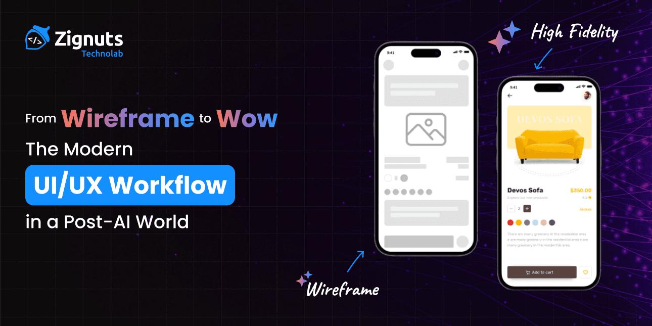
4. High Fidelity Prototyping in the UI/UX Workflow
The gap between a design file and a working product has practically vanished. Prototyping in 2026 is indistinguishable from the final app experience. We have moved beyond the days of stitching together static images to fake an interaction. Today, we build functional simulations that run on code logic. We utilize tools that bridge the divide between vector drawing and front-end code, allowing us to test technical feasibility in real time. We are no longer presenting a slideshow of what the app might look like. We are handing over an installed application that behaves exactly as intended.
We are designing with physics and motion from the start. We do not just show how a screen looks. We demonstrate how it feels. Does the page have weight when you scroll? Is the transition snappy or gentle? These sensory details are where quality is defined. We treat motion not as decoration but as a cognitive aid that helps users understand spatial relationships. We ensure that every animation serves a purpose, guiding the eye and reducing the cognitive load required to understand a new interface.
This phase allows stakeholders to hold the vision in their hands. It turns abstract conversations into a tangible reality. We stress test the emotions here. If the interaction does not bring joy or clarity, we refine it immediately. We fail fast in the prototype so we can succeed in the build.
Here is how we push the boundaries of modern prototyping:
- Conditional Logic Integration:
Static flows are obsolete. We build prototypes that remember user choices. If a user selects a specific preference on screen one, the prototype remembers that variable and alters the content on screen four. We test complex branching paths involving error states and success criteria without writing a single line of production code. This proves the logic works before engineering begins.
- Live Data Injection:
We have banished Lorem Ipsum from our vocabulary. Modern prototypes connect to real APIs or generate synthetic data sets that mimic live environments. We test how the layout breaks when a user has a fifty-character name or when a dashboard displays zero data. This reveals edge cases that a perfect sample text always hides.
- Haptic Choreography:
The experience is not just visual. It is tactile. We design the vibrations and feedback patterns that accompany digital actions. We define the specific buzz a user feels when a transaction succeeds versus the heavy thud they feel when an error occurs. We synchronize these tactile cues with visual animations to create a deeply immersive sensory experience.
- Multi-Modal Input Testing:
Interfaces in 2026 often exist beyond the glass screen. We prototype for voice commands, hand gestures, and gaze detection simultaneously. We ensure that a user can switch between typing and speaking without the system losing context. We test the friction of these handoffs to ensure the experience feels seamless regardless of the input method.
- Device Agnostic Fluidity:
We do not just prototype for one screen size. We build responsive components that adapt to foldables, tablets, and spatial computing headsets. We test how the interface reflows when a window is resized dynamically. We ensure the content remains readable and accessible, whether it is projected on a wall or squeezed onto a watch face.
- Dev Ready Code Inspection:
The prototype is the documentation. We use tools that allow developers to inspect the motion curves, timing functions, and component properties directly. This eliminates the need for redlining or writing lengthy spec documents. The developer sees the exact code required to replicate the prototype's behavior, ensuring the final build matches the design intent perfectly.
5. Validation and Testing in the UI/UX Workflow
Feedback loops are now continuous rather than episodic. We do not wait for a final build to see if users understand the product. In the past, testing was a bottleneck that happened at the end of the timeline. Now, it is the heartbeat of the process. We test concepts before they are even drawn. We test logic before it is coded. We validate the "why" before we validate the "how."
Synthetic user testing gives us immediate logical feedback on navigation paths and broken flows. It catches the obvious errors instantly, acting like a spellchecker for experience design. It simulates thousands of users trying to break the interface in minutes. However, we still prize real human interaction for the deeper insights. A machine cannot tell you if an experience felt cold or welcoming. It can track clicks, but it cannot measure delight. It creates a baseline of functionality so that our time with real humans can be spent discussing feelings, values, and trust.
We sit with users to observe their microexpressions. We listen to what they do not say. This qualitative data is gold. It helps us tune the product to feel personal and considerate. We look for the moment a user hesitates, not because the button is too small, but because they are unsure if they can trust the outcome. We act as the translators of emotion, turning a user's sigh of frustration into a design improvement that the algorithm missed.
Here is how we validate the human experience in 2026:
- Augmented Observation:
We use tools that transcribe and analyze user sessions in real time. These tools highlight moments where the user's voice pitch changes or their pace slows down. These points lead us directly to areas of friction or confusion that might not be obvious from screen recording alone. We use this data to ask better questions during the session, digging deeper into the user's psyche while the memory is fresh.
- Cognitive Load Balancing:
We test for mental exhaustion, not just task completion. We measure how much effort it takes for a user to process a screen. If a user completes a task but feels drained afterwards, that is a failure. We use eye tracking and focus analysis to ensure the interface respects the user's energy levels. We strip away elements that demand unnecessary attention.
- Trust and Safety Audits:
Validation is no longer just about usability. It is about safety. We explicitly test for potential harms. We ask users if the interface feels manipulative or if the privacy settings feel transparent. We stress test the language to ensure it does not sound coercive. We validate that the product respects the user's autonomy and does not trick them into patterns they did not intend to choose.
- Cultural Resonance Validation:
We move beyond translation checks. We validate cultural fit. We put the product in front of users from different regions to ensure the imagery and tone land correctly. We look for subtle misunderstandings that occur when a Western design pattern clashes with an Eastern mental model. We ensure the product feels native to the user's culture, not just a localized port.
- The "Vibe" Check:
This is the intangible metric. We ask users to describe the personality of the product. Is it a helpful assistant or a strict boss? Is it a playful friend or a boring form? We compare these descriptors against our brand values. If the users feel the product is "cold" or "robotic," we go back to the visual and interaction design phases to inject more warmth and humanity.
- Neurodiverse Usability:
We ensure our testing pool includes neurodiverse individuals. We validate that the motion design does not trigger vestibular issues. We check that the color contrast and information density are comfortable for users with ADHD or dyslexia. We do not treat accessibility as an edge case. We treat it as the baseline for a robust and resilient validation process.
Hire UI/UX Designers Today!
6. Developer Handoff in the UI/UX Workflow
The infamous wall between design and development has crumbled. The handoff is no longer a moment of friction but a continuous stream of collaboration. In the old days, designers would throw static images over a fence and hope the final product looked somewhat similar. Today, that method is extinct. We work in a shared digital environment where the boundaries between a design file and a code repository are blurred.
Design files now speak the same language as the code base. Variables and tokens are synced automatically. This means developers can focus on complex logic and architecture rather than measuring margins or guessing hex codes. The source of truth is singular. When a designer tweaks a border radius or updates a spacing variable, a pull request can be generated automatically. We have eliminated the "translation layer" where errors used to hide.
The conversation has shifted from "How do I build this?" to "How do we make this performant and scalable?" It is a partnership where both sides work toward a unified, polished outcome. We have moved from a "hand off" to a "handshake," recognizing that a beautiful design is worthless if it breaks the build or slows down the browser.
Here is how we ensure a seamless transition from concept to code:
- Semantic Design Tokens:
We do not pass hard-coded values like hex codes or pixel integers. We pass logic. We define "Surface Danger" or "Text Primary," which map to specific values for light and dark modes in the codebase. This shared vocabulary prevents the fragmentation that used to plague large products. It ensures that if we rebrand in the future, we change the value in one place, and it propagates everywhere instantly.
- Automated Boilerplate Generation:
AI tools now analyze the design component and generate the React, Vue, or Swift wrapper instantly. Developers no longer waste time typing out standard CSS properties or layout grids. They spend their energy connecting the API, optimizing the data flow, and ensuring the component is secure. The machine writes the boring code so the human can write the smart code.
- Bi-Directional Syncing:
The relationship is no longer one-way. If a developer updates a standard component in the repository to improve accessibility or performance, those changes ripple back into the design file. The design system stays honest to the production code. This prevents the "drift" where the design file shows an idealized version of the product that no longer exists in reality.
- Interactive Component Playgrounds:
Documentation is not a static PDF or a slide deck. It is a live sandbox where developers can toggle states and see how the UI behaves. We embed the specific animation curves, timing functions, and interaction behaviors directly next to the code snippets. The developer does not have to guess how a menu should slide in; they can play with the physics in the documentation itself.
- Pre Commit Visual QA:
We catch visual regressions before the code is merged. Automated tools compare the coded implementation against the design intent pixel by pixel. This ensures that the fit and finish are preserved. If a developer accidentally breaks the alignment of a button while fixing a bug, the system flags it immediately.
- Contextual Communication Channels:
We do not have meetings to explain a dropdown menu. We leave the video context right inside the file. Designers record a quick walkthrough of complex interactions, explaining the "why" behind the logic. This allows developers to consume the information asynchronously and understand the intent without needing to schedule a call.
7. The Human Core of the UI/UX Workflow
Looking at the process in 2026, it is clear that our role has evolved. We are no longer just making things look good. We are the guardians of the user experience in a world flooded with automated content. We stand between the user and the infinite noise of the machine.
Technology gives us speed and scale. It handles the repetitive and the mundane tasks that used to burn us out. But it lacks intuition. It lacks a heart. It is created based on patterns, not purpose. That is where you come in. The future belongs to those who can wield these powerful tools with a sensitive human touch. We act as the filter that separates the technically possible from the emotionally resonant.
The magic is not in the software. The magic is in your ability to connect with another person through a screen. The tools we use will continue to change, but the fundamental human need to be understood will never go away.
Here is why the human element remains the most valuable asset:
- The Curator of Quality:
In an age of abundance, curation matters more than creation. AI can generate a thousand layouts in a minute, but nine hundred and ninety-nine of them will be average. You provide the taste. You provide the judgment. You provide the restraint to choose the single design that feels simple, elegant, and necessary.
- The Ethical Compass:
Algorithms are designed to optimize for engagement, often at the cost of user well-being. A machine does not know when a notification becomes intrusive or when a gamification loop becomes addictive. You are the one who draws the line. You advocate for the user's mental health and privacy, ensuring that we build technology that respects human dignity.
- The Champion of the Unquantifiable:
Data can tell us what users do, but it cannot tell us how they feel. It misses the "vibe" of a product. It misses the delight of a witty piece of microcopy or the satisfaction of a perfectly timed animation. You bring the intangible qualities of warmth, humor, and surprise that turn a utility into a beloved product.
- The Strategic Storyteller:
Features do not sell products. Stories do. While AI can write coherent sentences, it cannot weave a narrative that connects with deep human desires and fears. You frame the technology in a way that makes sense to people's lives. You build the narrative arc that guides a user from curiosity to loyalty.
- The Master of Empathy:
True empathy requires shared experience. A machine has never felt frustration, joy, or confusion. You have. When you design an error message, you write it with kindness because you know what it feels like to make a mistake. When you design a celebration screen, you design it with genuine enthusiasm. That shared humanity is the bridge that no algorithm can ever cross.
Conclusion
As we navigate the mature landscape of 2026, the distinction between a good product and a great one has become undeniable. It is no longer about who can ship the fastest or who has the most features. It is about who can foster the strongest connection. The tools we have discussed are powerful, but they are ultimately just instruments. They require a virtuoso to play them effectively. Real value is created when we use technology to amplify our empathy rather than replace it.
To thrive in this environment, you need a team that views AI as a launchpad, not a crutch. You need creators who can navigate the complexities of data while keeping a firm hand on the emotional steering wheel. When you Hire UI/UX Designers at Zignuts, you are securing partners who understand this delicate equilibrium. We do not just deliver code and pixels; we deliver experiences that resonate on a human level.
Ready to infuse your digital product with a genuine human connection? Contact Zignuts today to discuss your vision, and let our team help you craft an emotionally resonant, intelligent solution that defines the future of your brand.

Chetan Singadia
Crafting meaningful digital experiences through strategic design thinking, user empathy, and a relentless commitment to visual and functional excellence.