


.svg)

.svg)


.svg)
.svg)

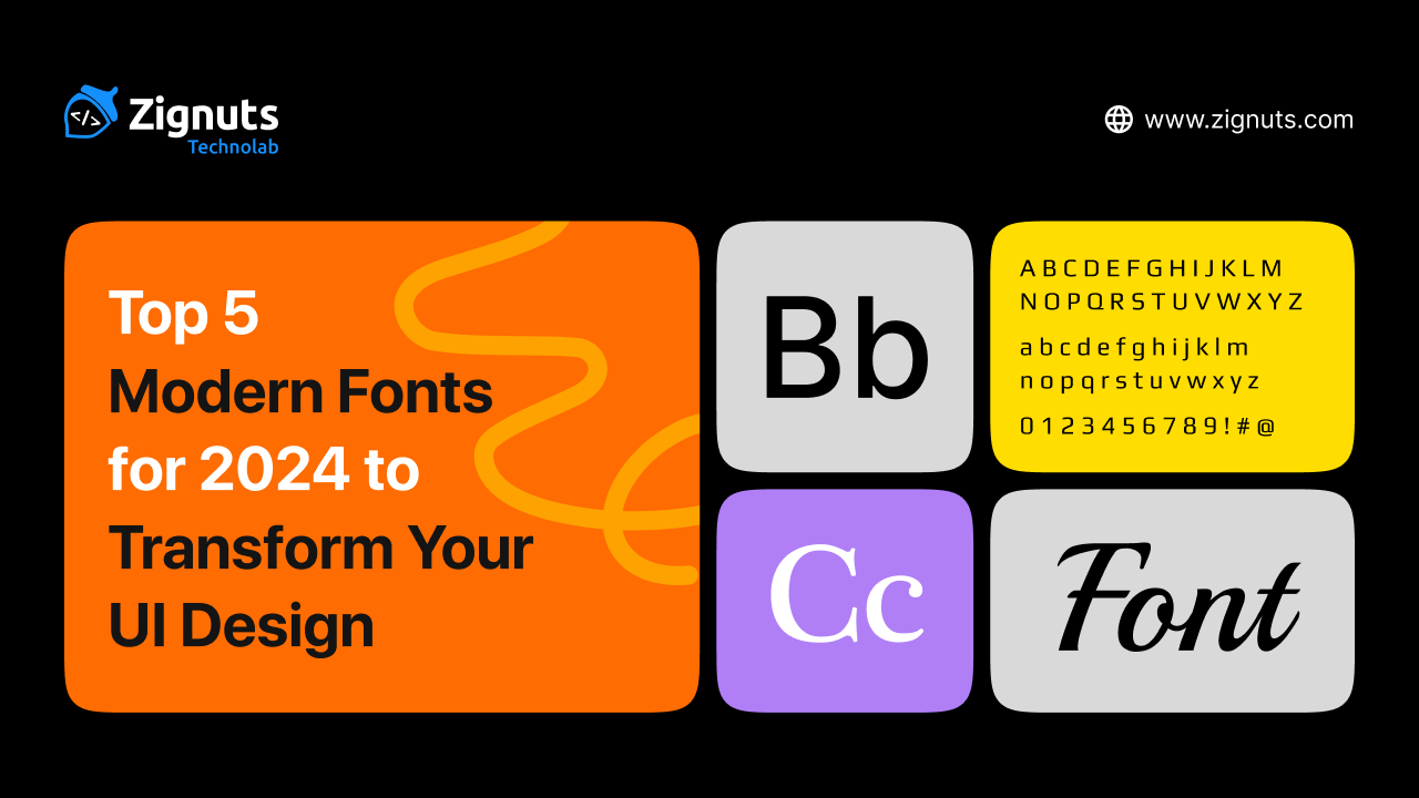

Fonts are much more than a visual choice; they are the silent engine driving how users feel and interact with a digital product. As we navigate through 2026, the landscape of typography has shifted toward deep personalization, accessibility, and high-performance variable technology. Modern fonts for 2026 are no longer static assets but dynamic tools that breathe life into interfaces, adapting to various light modes and screen resolutions with ease.
In this digital-first era, typography has evolved into a performance-driven art form. With the rise of AI-driven adaptive interfaces and spatial computing, the demand for typefaces that offer both technical precision and emotional resonance has never been higher. Modern fonts for 2026 must solve complex design challenges, such as maintaining legibility in augmented reality overlays or adjusting their weight in real-time to match a user’s ambient lighting. We are seeing a move away from the "sterile" minimalism of the past decade toward "Soft Brutalism" and expressive, kinetic styles that allow words to function as the primary visual art of a UI Design.
In this guide, we explore the top 10 typefaces currently redefining digital spaces. From ultra-legible sans serifs to expressive contemporary serifs, these selections will help your projects stand out in an increasingly crowded digital world.
Why Modern Fonts for 2026 Matter for UI Design
In the current design era, typography is the backbone of the user experience. With the rise of immersive spatial computing and hyper-minimalist dashboards, fonts must be exceptionally legible and personality-driven. Typography has moved past being a simple carrier of information to becoming a core interactive element that adapts to the user's environment and emotional state. Choosing a contemporary typeface allows you to:
- Ensure Inclusive Design: Modern typefaces often include specialized glyphs and optimized spacing for better accessibility. In 2026, accessibility is a foundation rather than a feature, with fonts designed to remain readable even for users with visual impairments or in challenging lighting conditions. This includes "inclusive character sets" that distinguish between commonly confused letters like "I," "l," and "1," ensuring that your interface is usable by the widest possible audience regardless of their visual acuity.
- Optimize Performance: The adoption of variable font technology means faster load times with more styling options. By using a single file for multiple weights and widths, you reduce server requests, which significantly boosts page speed and improves SEO rankings. In a world where every millisecond of latency can lead to user drop-off, a streamlined font strategy is a competitive advantage that ensures a smooth, instantaneous interaction across all devices.
- Create Emotional Resonance: Typography carries the weight of your brand’s voice, moving from "neutral" to "intentional" in 2026. Whether through "Soft Brutalism" or "Tactile Maximalism," the right font sets the atmospheric tone, turning a cold digital interface into a relatable brand story. By selecting typefaces with unique "ink traps" or geometric quirks, you can humanize a tech-heavy product and build a deeper psychological connection with your users.
- Support Adaptive and Spatial Interfaces: As we move into 3D environments and AR, fonts must maintain clarity across different depths and viewing angles. Modern fonts for 2026 are built to scale fluidly, ensuring that text remains sharp whether it is on a tiny wearable screen or floating in a spatial workspace. These fonts often feature specialized "optical sizing" that automatically adjusts the letterforms’ thickness and spacing depending on how large they appear to the user.
- Enhance Kinetic Interactivity: Text is no longer static. Modern UI Design frequently uses kinetic typography where letters respond to scroll depth, hover states, or even haptic feedback, making the reading experience feel alive and responsive to user intent. This dynamic behavior helps guide the user's eye to high-priority information, creating a self-navigating interface that reduces cognitive load.
Let’s look at the ten typefaces leading the charge this year.
1. Inter: The Gold Standard for Modern UI Design
Originally built specifically for computer screens, Inter remains a powerhouse in 2026. It features a tall x-height that makes reading long passages of text effortless. Designers love it because it feels invisible in the best way possible, allowing the content to take center stage without distraction.
In the high-performance landscape of 2026, Inter has evolved beyond a simple font choice; it is now a technical necessity for complex digital ecosystems. With the release of version 4.0 and beyond, it has cemented its place as the primary "interface engine" for everything from SaaS dashboards to spatial computing overlays. Its beauty lies in its neutrality, providing a crystal-clear canvas that supports both light and dark mode transitions with zero loss in legibility.
Why Inter Dominates UI Design in 2026
- Exceptional Legibility at Micro-Sizes: Designed with a massive x-height and open apertures, Inter ensures that lowercase letters remain distinct even when rendered as tiny labels or footnotes.
- Deep Customization with OpenType Features: The font includes a suite of "secret" features like contextual alternates, slashed zeros to distinguish from "o," and tabular numbers, which are essential for data-heavy finance and crypto apps.
- Variable Font Performance: As a variable font, Inter allows designers to manipulate weight and optical sizing fluidly. This means faster load times for your UI Design while offering infinite styling possibilities within a single file.
- Optical Sizing for Every Context: In 2026, the font utilizes an optical size axis that automatically optimizes the letter shapes. It stays sharp and detailed in large headlines while becoming more robust and spaced out for small body text.
- The "Invisible" User Experience: Because it mimics the vertical metrics of system fonts, it feels instantly familiar to users, reducing cognitive load and making navigation feel intuitive.
How to Use It
- For Data-Rich Dashboards: Leverage the tabular figures and slashed zero features to make numbers easy to compare and error-free for the user.
- For Mobile First Apps: Use the variable weight axis to slightly thicken the text on smaller screens, ensuring it remains readable even in low-light environments.
- For Sophisticated Pairings: Combine Inter’s neutral body text with a high-contrast serif for headings to add a touch of editorial luxury to your project.
2. Geist: The Minimalist’s Dream for UI Design
Developed by the team at Vercel in collaboration with Basement Studio, Geist has rapidly become a favorite for technical and developer-focused interfaces. Its geometric precision and "cool" aesthetic make it perfect for SaaS platforms and dashboards where clarity and a modern edge are the top priorities.
In 2026, Geist has expanded into a comprehensive design system of its own. Drawing inspiration from classic Swiss typography, it balances a rigid, grid-based structure with subtle modern refinements that prevent it from feeling too mechanical. It is the go-to choice for products that want to communicate "speed" and "innovation" at a glance.
Why Geist is a Top Choice for UI Design in 2026
- Precision Engineering for Developers: Geist was built by developers, for developers. It features optimized vertical metrics that ensure perfect alignment within buttons, navigation bars, and complex data tables.
- The "Pixel" Extension for Creative UI: The 2026 update includes "Geist Pixel," a bitmap-inspired variant that allows designers to add a futuristic, digital-first texture to headlines without breaking the overall typographic hierarchy.
- Seamless Mono and Sans Integration: Geist Sans and Geist Mono are designed to work in perfect harmony. In 2026, switching between body copy and code snippets in a documentation site or a terminal-based app is visually seamless.
- High-Contrast Legibility: The font features short descenders and a generous x-height, which are specifically tuned to keep text sharp on high-density displays (Retina/OLED) used in modern smartphones and laptops.
- Swiss Design Heritage: By borrowing principles from timeless typefaces like Univers and Helvetica, Geist provides a "premium" feel that lends immediate credibility to new tech brands and startups.
How to Use It
- In SaaS Dashboards: Use Geist Sans for the main interface and Geist Mono for data inputs or ID tags to create a clear visual distinction between types of information.
- For Technical Documentation: Its open counters and clear character differentiation (like a distinct "l" and "I") make it the safest choice for reading long-form technical guides.
- In Experimental Layouts: Mix in the new Geist Pixel variants for secondary headings or "Easter egg" details to give your UI Design a cutting-edge, unapologetically digital vibe.
3. Satoshi: Sophisticated Geometry in UI Design
Satoshi combines the best of traditional grotesques with modern geometric shapes. It feels exceptionally fresh in 2026 due to its balance of sharp terminals and open counters. It’s an ideal choice for brands that want to look professional yet approachable.
In the design landscape of 2026, Satoshi has emerged as the premier choice for "Modernist Minimalism." While many geometric fonts feel cold or overly mechanical, Satoshi introduces subtle humanist touches that make digital interfaces feel warmer and more inviting. It has become a staple for premium e-commerce and lifestyle platforms that require a high-end feel without the heavy price tag of custom typefaces.
Why Satoshi is a Powerhouse for UI Design in 2026
- Geometric Precision with a Human Soul: Unlike strict geometric fonts, Satoshi incorporates slight variations in stroke weight and curvature. This prevents "eye fatigue" during long reading sessions, making it superior for content-heavy applications.
- Variable Design for Responsive Layouts: In 2026, the Satoshi variable version is widely used to create fluid typography systems. Designers can adjust the weight precisely to ensure that headings remain impactful on desktop while scaling down gracefully for mobile UI Design.
- Built-in Stylistic Alternates: One of Satoshi’s hidden strengths is the extensive set of OpenType features. It offers alternate versions for characters like "t," "a," and "g," allowing designers to tweak the font’s personality from "strictly professional" to "playfully modern" with a single click.
- Industrial Era Inspiration: The font draws inspiration from the Modernism movement, giving it a timeless quality. In 2026, this "New Retro" aesthetic is trending, helping tech brands look established and trustworthy.
- High-Contrast Terminals: The sharp, clean cuts at the ends of letters give Satoshi a crisp appearance on 4K and 8K displays, ensuring your UI Design looks sharp and high-definition.
How to Use It
- For Premium E-commerce: Use the "Light" and "Regular" weights for product descriptions to create a sophisticated, airy feel that lets high-quality product imagery shine.
- For Fintech and Crypto Platforms: Utilize the "Bold" and "Black" weights for balance displays and headings. The geometric clarity of the numbers makes financial data look organized and secure.
- As a Hero Font: Pair Satoshi with a high-contrast serif for a "Classic Modern" look. Use Satoshi for the navigation and UI elements, while using a serif font for the main storytelling headlines.
4. Bricolage Grotesque: Adding Human Touch to UI Design
As AI-driven designs become more prevalent, Bricolage Grotesque offers a refreshing, human-centric quirkiness. It is a variable font that moves between a calm, standard look and an expressive, slightly eccentric style, making it perfect for brands that want to showcase personality.
In 2026, when digital interfaces can often feel "over-polished" and robotic, Bricolage Grotesque acts as an emotional bridge. Its name, French for "tinkering" or "improvising," perfectly describes its aesthetic: a thoughtful patchwork of historical French and British typographic influences. It is the leading choice for consumer-facing AI applications, creative portfolios, and lifestyle brands that need to feel "hand-crafted" while remaining technically robust.
Why Bricolage Grotesque is Essential for UI Design in 2026
- Emotional Innovation: This font is specifically engineered to introduce a "human soul" into modern interfaces. It helps build immediate trust by appearing more approachable and less "corporate" than standard neo-grotesques.
- Three-Axis Variability: Unlike basic fonts, Bricolage allows for precise control over Weight, Width, and Optical Size. This means you can stretch it for a bold, "wonky" hero section or compress it into a clean, professional sidebar without losing visual harmony.
- Intelligent Ink Traps: The exaggerated ink traps aren't just for style; they serve a functional purpose in 2026. At small sizes, they prevent the letters from "clogging" on high-brightness OLED screens, ensuring your UI Design remains crystal clear even at micro-resolutions.
- Hybrid Cultural Aesthetic: By blending the "relaxed confidence" of French styles like Antique Olive with the "strict authority" of British Grotesques, it offers a unique, sophisticated vibe that stands out in a sea of generic fonts.
- Adaptive Optical Sizing: The font physically changes its structure as it scales. It becomes more neutral and readable for body text while revealing its quirky, expressive character in large headings.
How to Use It
- For Brand Storytelling: Use the wide, expressive weights for pull-quotes and headlines to inject a sense of warmth and "tinkering" into your site’s narrative.
- In Consumer AI Apps: Its friendly yet rational structure makes it perfect for chat interfaces and onboarding screens where you want the AI to feel like a helpful peer.
- Strategic Pairing: Because its display weights are so full of character, pair it with a more "restrained" font like Inter or Public Sans for long-form body copy to maintain a high-performance balance.
5. Figtree: Friendly and Versatile UI Design
Figtree is the definition of a "workhorse" font. It is clean, friendly, and incredibly easy to read at small sizes. In 2026, it will be widely used in mobile apps where space is at a premium, but a welcoming vibe is still required to keep users engaged.
Designed by Erik Kennedy, Figtree was crafted with a "UI-first" mindset. It effectively bridges the gap between the rigid geometry of classic sans serifs and the warm, approachable nature of humanist typefaces. This unique balance makes it one of the most reliable choices for 2026, as brands move away from sterile interfaces toward more "livable" digital experiences.
Why Figtree is a 2026 Favorite for UI Design
- High X-Height for Maximum Readability: Figtree features an elevated x-height, which is a game-changer for mobile screens. It ensures that lowercase letters are nearly as legible as uppercase ones, allowing users to scan long lists or dense settings menus without squinting.
- Punchy and Sturdy Capital Letters: In 2026, Figtree’s uppercase glyphs are noted for being slightly widened and sturdy. This makes them perfect for "Call to Action" (CTA) buttons and navigation labels that need to feel authoritative yet friendly.
- Sophisticated Numeric Sets: For apps involving data, Figtree offers specialized tabular numbers and monospace figures. This ensures that columns of numbers in a fitness tracker or a banking app stay perfectly aligned, improving the "scannability" of financial information.
- Friendly Geometric Detail: While it follows a geometric structure, it avoids being "stiff." Its rounded terminals and playful details like the bend in the number "1" or the unique curve of the lowercase "y" add a subtle energy that makes the UI Design feel more personalized.
- Performance-Ready Variable Axis: As a variable font, Figtree allows designers to toggle weight on a granular scale. In 2026, this is used to create "responsive weight," where the font automatically becomes bolder on smaller screens to compensate for lower physical contrast.
How to Use It
- For Mobile-First Interfaces: Its clarity at small sizes makes it the ideal candidate for mobile-only platforms. Use the "Regular" weight for body copy and "Bold" for section titles to create a clear visual hierarchy.
- In Button-Heavy Designs: Because of its sturdy caps, use Figtree for buttons and labels. It provides a tactile, "clickable" feel that guides the user’s hand intuitively.
- For Onboarding and Success Screens: Leverage its friendly, approachable vibe in the first screens a user sees. It helps reduce "onboarding anxiety" by making the technology feel less intimidating and more human-centric.
Ready to elevate your digital product's user experience? Start your project with Zignuts expert UI/UX designers.
**Hire now**Hire Now**Hire Now**Hire now**Hire now

6. Instrument Serif: Editorial Elegance in UI Design
The trend of using serifs in digital interfaces has peaked in 2026, and Instrument Serif leads the way. It brings a refined, high-end editorial feel to headers and landing pages, proving that modern interfaces don't have to be limited to sans-serif styles.
In the 2026 design landscape, Instrument Serif has transitioned from a niche "brand font" to a global UI Design standard for luxury tech and high-end editorial platforms. It offers a contemporary twist on old-style serifs, blending 1980s nostalgia with the ultra-sharp demands of 8K displays. It is the preferred choice for designers who want to break away from the "boring" uniformity of corporate sans-serifs and inject a sense of history and authority into their digital products.
Why Instrument Serif is the Luxury Choice for UI Design in 2026
- Premium Editorial Aesthetic: Instrument Serif mimics the sophisticated layouts of high-fashion magazines like Vogue. In 2026, this "Editorial UI" trend uses high-contrast serifs to make digital content feel like a curated, tactile experience rather than just another webpage.
- Condensed Display Dynamics: As a condensed font, it allows for massive, high-impact headlines that take up significant vertical space without feeling cluttered. This is particularly effective for mobile hero sections where horizontal space is limited but visual drama is required.
- Contemporary "Tech-Serif" Flavor: Unlike traditional book serifs, Instrument Serif features sharp, purposeful terminals and a vertical axis that feels modern and architectural. It bridges the gap between the "old world" and the "new tech" era, making it a favorite for AI-driven premium services.
- Optimized for Display Clarity: While many serifs struggle at small sizes on screens, Instrument Serif is specifically engineered for high-density displays. Its stroke contrast is finely tuned to prevent thin lines from "disappearing" against vibrant background colors or in high-brightness environments.
- White House Proven Credibility: Its recent adoption by major global institutions and government rebrands has cemented its reputation as a font of "Modern Authority." It tells the user that the information they are reading is credible, established, and high-quality.
How to Use It
- For High-Impact Hero Sections: Use it at large sizes (72px and above) for your primary headings. Let the letterforms act as the main graphic element of the UI Design, reducing the need for heavy imagery.
- In Brand Wordmarks: Its unique character makes it excellent for logotypes within an interface. Use it for the brand name in the navigation bar to instantly signal a premium or "boutique" positioning.
- Strategic Pairings: Pair it with its sibling, Instrument Sans, for a perfectly harmonious UI. Use the Serif for titles and the Sans for functional elements like buttons and body text to maintain an elegant balance.
7. Plus Jakarta Sans: The Modern Corporate UI Design
Originally created for city branding, this font has migrated into the tech world. It offers a punchy, energetic look that works beautifully for modern startups and corporate platforms that want to move away from the "boring" defaults of the past.
In 2026, Plus Jakarta Sans has become the unofficial signature of the "Collaborative Economy." Its origins in the +Jakarta City of Collaboration program have infused it with a spirit of community and modern ambition. It strikes a rare balance: it is professional enough for a boardroom presentation but vibrant enough for a consumer-facing social app. Tech giants and agile startups alike use it to signal that they are fast-moving, innovative, and transparent.
Why Plus Jakarta Sans is a Corporate Powerhouse for UI Design
- Vibrant and Modern Energy: Unlike traditional corporate fonts that can feel "stuffy," Plus Jakarta Sans features pointed curves and almost monolinear contrast. This gives it a high-energy, "pop" aesthetic that makes your UI Design feel fresh and current.
- Extra-Tall X-Height for Clarity: The font is engineered with an unusually tall x-height, which increases the white space within lowercase letters. This makes it exceptionally easy to read on mobile devices, where users are often scanning text quickly while on the move.
- Unique Stylistic Sets (Sharp, Straight, Swirl): One of its most powerful features in 2026 is its diversity of form. It includes three stylistic alternates: Lancip (Sharp), Lurus (Straight), and Lingkar (Swirl), allowing designers to customize the font’s personality to match different brand identities without switching families.
- Optimized for Complex Information Design: Because it was designed for a city's complex communication needs, it handles dense information layouts beautifully. It is a top choice for "Bento Grid" layouts and information-heavy landing pages where clarity is a non-negotiable requirement.
- Full Variable Weight Range: With a weight range spanning from 200 (Extra Light) to 800 (Extra Bold), it provides total flexibility. In 2026, designers use these variable axes to create subtle transitions in weight for interactive elements like hover states or active button modes.
How to Use It
- For Startup Landing Pages: Use the "Extra Bold" weight for your main value proposition to grab attention instantly. The font's geometric clarity ensures that your message feels both bold and trustworthy.
- In Collaborative Software UI: Its friendly yet structured look makes it the perfect choice for project management tools, messaging apps, and community platforms where a "collaborative" vibe is essential.
- For Scalable Design Systems: Because it offers such a wide range of styles and alternates, it can serve as the primary font for an entire global brand, reducing the need for multiple font licenses and simplifying your technical stack.
8. Space Grotesk: Futuristic Energy for UI Design
For projects involving Web3, gaming, or futuristic tech, Space Grotesk is the go-to. It retains enough legibility for functional use while adding unique, quirky letterforms that suggest innovation and forward-thinking.
In 2026, Space Grotesk has moved from the "experimental" fringes to become a staple of the "Tech-Modernist" aesthetic. Derived from the monospaced Space Mono, this proportional variant offers the structural discipline of a technical font but with the rhythm and readability needed for complex user interfaces. It is the leading choice for developers and designers building decentralized platforms, AI tools, and virtual environments where the brand needs to feel "coded" yet accessible.
Why Space Grotesk is the Tech Standard for UI Design in 2026
- Cyber-Grotesque Aesthetic: By blending classic Swiss grotesque proportions with idiosyncratic "techy" details, Space Grotesk perfectly captures the "Industrial-meets-Internet" vibe. It gives your UI Design an immediate sense of being cutting-edge and high-performance.
- Distinctive High-Tech Letterforms: The font features unique, recognizable glyphs such as the sharp, diagonal cuts on the lowercase "g" and the curved tail of the "y." These details act as micro-branding elements that help your interface stand out without needing extra graphic assets.
- Optimized for Display Screens: Unlike older geometric fonts, Space Grotesk was designed with digital rendering in mind. Its open apertures and low contrast ensure that it stays crisp on everything from a high-end desktop monitor to a small mobile screen in a crypto-wallet app.
- Built-in Data Visualization Power: The 2026 update includes robust support for tabular figures and mathematical symbols. This makes it an excellent choice for real-time data feeds, stock tickers, and gaming HUDs where numbers must be perfectly aligned and instantly scannable.
- Global Language Support: As the tech world becomes more global, Space Grotesk’s extended Latin support (including Vietnamese and Pinyin) ensures that your tech-forward UI Design looks consistent and professional for a worldwide audience.
How to Use It
- For Web3 and Blockchain Dashboards: Use the "Medium" weight for transaction lists and wallet balances. The font's mechanical structure reinforces the feeling of security and technical precision.
- In Gaming UI and HUDs: Its futuristic flair makes it perfect for navigation menus, quest logs, and on-screen overlays. Use it in all-caps for a more aggressive, high-stakes sci-fi aesthetic.
- Technical Hero Sections: Pair Space Grotesk with a highly neutral sans-serif like Inter for body text. Use Space Grotesk for the massive, eye-catching headlines to immediately signal "Innovation" to the user.
9. Aeonik: Graphic Precision for UI Design
Aeonik is favored by designers who want a "structural" feel. It is highly disciplined and looks stunning in large hero sections. Its mechanical precision is softened by subtle curves, making it one of the most balanced fonts available for digital products today.
In 2026, Aeonik has evolved into a "superfamily," expanding its reach from high-end branding into the heart of functional UI Design. Often described as a "neo-grotesque with a geometric skeleton," it provides a level of architectural stability that few other fonts can match. It has become the secret weapon for global fintech leaders and premium automotive interfaces that need to convey both technical excellence and refined luxury.
Why Aeonik is the Structural Leader for UI Design in 2026
- Mechanical Precision with Closed Apertures: Aeonik features strict perpendicular terminals (seen in the letters "a," "t," and "f"), which give it a rigid, professional appearance. This is masterfully balanced by the geometric roundness of its "o" and "c," creating a look that is both disciplined and visually pleasing.
- Massive Language Support for Global UI: The 2026 version of Aeonik Pro supports over 340 languages, including expanded scripts like Arabic, Hebrew, Thai, and Hangul. This ensures that global brands can maintain a consistent "structural" identity across diverse international markets.
- The "Aeonik Soft" Variant for Humanist Appeal: A recent addition to the family, "Aeonik Soft," tempers the sharp geometry of the original with subtly rounded details. This version is perfect for 2026 interfaces that require a "friendlier" voice without sacrificing the font's signature structural integrity.
- Variable Font Performance: Aeonik now fully utilizes variable font technology, allowing designers to fine-tune weights from the delicate "Air" to the commanding "Black." This helps optimize page load speeds in complex UI Design while offering infinite flexibility for responsive breakpoints.
- Invisible Hierarchy Management: Because the weights are so meticulously calculated, switching between a "Medium" subhead and a "Regular" body copy feels perfectly natural. It creates an effortless visual hierarchy that guides users through complex information without visual friction.
How to Use It
- For High-End Tech Branding: Use the "Air" or "Thin" weights in large hero sections for a minimalist, "designed-by-algorithm" look that feels expensive and cutting-edge.
- In Data-Heavy Fintech Apps: Its rigid structure makes it ideal for digital banking apps. Use it for transaction histories and numerical data to evoke a sense of security and precision.
- Pairing for Contrast: In 2026, a popular trend is pairing Aeonik with its monospaced sibling, Aeonik Fono, for labels and secondary metadata. This creates a cohesive "technical" ecosystem within your UI Design.
10. Atkinson Hyperlegible: Accessibility First in UI Design
Accessibility is no longer optional in 2026, and this font is the champion of that movement. Designed to increase character recognition for users with low vision, it has become a staple for government, healthcare, and educational platforms that prioritize every single user.
In the 2026 design era, the release of "Atkinson Hyperlegible Next" has redefined what inclusive typography looks like. It is no longer just a "specialty" font; it is a mainstream powerhouse used by designers to ensure their UI Design meets global WCAG 3.0 standards. By intentionally "breaking" traditional typography rules to differentiate similar characters, it ensures that every user, regardless of their visual acuity, can navigate a digital interface with confidence and ease.
Why Atkinson Hyperlegible is the Gold Standard for Inclusive UI Design
- Radical Character Differentiation: The font’s primary mission is to eliminate character confusion. It uses unique "tails" on the lowercase "j," a crossed "0" (zero) to distinguish it from a capital "O," and specialized serifs on the uppercase "I" to ensure it is never mistaken for a lowercase "l" or the number "1."
- Advanced Variable Weight Axis: The 2026 update introduced a full variable range with seven distinct weights. This allows designers to optimize text thickness dynamically, ensuring that the font remains "hyperlegible" whether it’s displayed on a high-contrast dark mode interface or a bright, outdoor digital kiosk.
- Expanded Global Support: Atkinson Hyperlegible Next now supports over 150 languages. In 2026, this makes it the go-to choice for international NGOs and global public service apps that need to deliver critical information to diverse populations without typographic barriers.
- New Monospace Variant for Technical UI: The addition of "Atkinson Hyperlegible Mono" in late 2025 has been a breakthrough for accessible coding and data entry. It provides the same high-recognition glyphs in a fixed-width format, opening up career paths in tech for low-vision developers.
- Open Counter Design: The font features exceptionally large "counters" (the open spaces inside letters like "o," "e," and "p"). This prevents the letters from "blurring" together for users with visual impairments, maintaining clarity even when the text is viewed at significant distances or on low-resolution screens.
How to Use It
- For Essential Public Information: Use it as the primary body font for healthcare portals, voting apps, and government websites where the cost of a user misreading information is high.
- In Error Messages and Alerts: Even if your main brand uses a different font, switch to Atkinson Hyperlegible for critical system alerts and error messages to ensure they are readable by everyone in high-stress situations.
- For Technical and Financial Data: Utilize the Monospace variant for transaction histories and account numbers. The clear distinction between numbers and letters reduces user errors in data-sensitive UI Design.
Best Practices for Modern Fonts for 2026 in UI Design
To make the most of these typefaces, follow these core principles
- Embrace Variable Axes:
Use the flexibility of variable fonts to fine-tune weights for dark mode, preventing "text glow" on dark backgrounds. In 2026, designers use the Grade (GRAD) axis to slightly reduce stroke thickness in dark mode without changing the character width. This ensures that the text doesn't appear to "bleed" or look blurry against high-contrast dark backgrounds, maintaining a consistent visual weight across all themes.
- Focus on Optical Sizing:
Many modern fonts now include optical sizing, which automatically adjusts the letterforms based on whether they are used as tiny labels or massive headlines. In 2026, this is handled through the opsz axis. When a font is scaled down to 10px, the system automatically opens up the counters and increases the x-height to maintain legibility. Conversely, at large display sizes, it tightens the spacing and refines the details for a more sophisticated look.
- Prioritize Contrast with APCA:
Ensure your font choice maintains a high contrast ratio against the background to meet the latest global accessibility standards. While WCAG 2.1 was the old standard, 2026 has fully embraced the Advanced Perceptual Contrast Algorithm (APCA). This system considers font weight and size alongside color, ensuring that thin fonts on dark backgrounds are just as readable as bold fonts on light ones. Always aim for a "Silver" or "Gold" rating in your accessibility audits.
- Limit Your Palette:
Stick to one or two font families. Use different weights and styles within those families to create a cohesive hierarchy. Overcomplicating your UI Design with too many typefaces creates "visual noise" and increases cognitive load. Instead, master the use of semantic hierarchy using a single variable font's weight and width axes to distinguish between titles, body copy, and metadata.
- Design for Spatial and 3D Contexts:
As spatial computing becomes mainstream in 2026, fonts must be legible from various viewing angles and depths. Use typefaces with clear apertures and distinct character shapes to prevent letters from merging when viewed in a 3D environment or through AR overlays. Adaptive typography systems now use device depth sensors to slightly increase font size or weight if the user moves further away from the screen.
- Implement Kinetic Pacing:
Kinetic typography (moving text) should be used as a functional tool, not just decoration. In 2026, motion is used to pace how information is absorbed. Ensure that any animated text resolves into a stable, static state quickly (under 300ms) so users can actually read the content. Motion should follow the "Sequential Reveal" pattern, guiding the eye from the primary headline down to the supporting content.
- Adopt Regional-First Systems:
For global products, your typography must be "India-First" or "Multi-Script" aware. In 2026, leading design systems choose fonts that support dual-scripting, where English and regional scripts (like Hindi or Gujarati) share the same vertical metrics. This prevents "layout jumping" when a user switches languages and ensures your UI Design remains aesthetically balanced across all markets.
Conclusion
In 2026, typography has evolved into a strategic asset that bridges the gap between high-performance technology and human emotion. Whether you are building a technical SaaS platform with Geist, a luxury editorial site with Instrument Serif, or an inclusive government portal with Atkinson Hyperlegible, your font choice defines the user's journey.
To stay ahead of these trends and ensure your product delivers a world-class experience, it is essential to Hire UI/UX Designers who understand the technical nuances of variable fonts and adaptive interfaces. At Zignuts, we specialize in transforming digital visions into high-performance realities through expert typography and user-centric design.
Ready to transform your UI? Contact Zignuts today to discuss your project. Our team is ready to help you build the future of digital experiences!


.webp)
.webp)
.webp)
.png)
.png)
.webp)
.webp)
.webp)
