In 2026, mobile typography has moved beyond static pixels into the era of Dynamic Interfaces and Liquid Design. With the widespread adoption of Apple’s "Liquid Glass" language (iOS 19) and Google’s "Expressive Material 3" (Android 16), the way we handle type is no longer just about size; it’s about contextual responsiveness, variable weight, and perceptual accessibility.
Modern typography now utilizes Biometric Adaptation, where on-device AI subtly adjusts font grades and tracking based on the user's viewing distance and ambient light levels. We have transitioned from a fixed "breakpoint" design to Fluid Type Scales, where font properties exist on a continuous spectrum. This evolution ensures that text remains perfectly legible whether viewed on a standard smartphone, a high-density foldable, or through spatial computing overlays.
This updated guide focuses on the specific nuances and hacks tailored for typography in the current mobile landscape, moving away from broad print concepts to the technical, high-performance reality of 2026 mobile ecosystems. We will explore how to leverage Variable Font Axes to reduce app binary size while maximizing visual impact and accessibility.
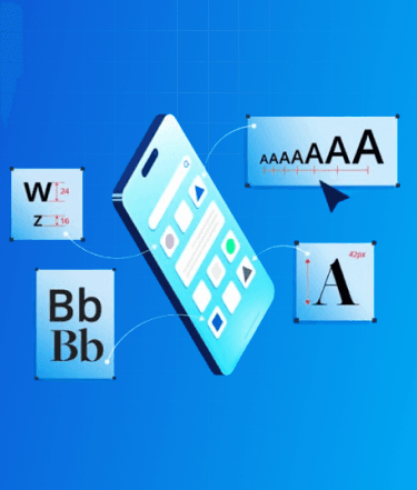
Top 7 Tips For Designing Better Mobile App Typography

1. Minimum Font Size & Variable Scaling
Modern mobile screens in 2026 feature extreme pixel densities and haptic-responsive surfaces, yet the core human limitation remains. Accessibility is now the primary driver, solidified by the industry-wide shift toward WCAG 3.0 (Silver/Gold levels) and the APCA (Advanced Perceptual Contrast Algorithm).
- iOS 19 (Human Interface Guidelines): The recommended default for Body text is 17pt. However, with the "Adaptive Glass" UI, your layout must remain functional even when the system-level Dynamic Type 3.0 scales text up to 400%.
- Android 16 (Material Design 3): The standard remains 16sp, but the "Expressive" type scale now favors 18sp as the baseline for high-density OLED displays to reduce sub-pixel flickering and eye fatigue in high-motion environments.
- The Variable Factor: In 2026, we no longer swap font files. We utilize Variable Fonts (like Roboto Flex or SF Pro Variable) to handle environment-specific adjustments. As text scales down, the system should automatically increase the font grade (GRAD) to maintain stroke thickness and legibility without altering character width or causing text-reflow jitter.

Recommendations
- Primary Body: Maintain a strict floor of 16pt/sp. For long-form reading apps, 18pt is the 2026 industry standard for minimizing cognitive load.
- Secondary Captions: The absolute floor is 12pt. These must be reserved for non-critical metadata; if the user cannot read them at the default scale, it should not break the task flow.
- Interactive Elements: Button labels and navigation links should leverage a slightly heavier Weight axis rather than just a larger size to ensure touch-target clarity.

Pro-Tip:
Adaptive Optical Sizing & Viewing Distance: Utilize the opsz (Optical Sizing) axis. In 2026, mobile OS engines will use the front-facing depth sensors to detect viewing distance. When the device is further from the eye, the system automatically adjusts the optical size axis to open up counters and increase x-height, ensuring the typeface remains "structurally sound" regardless of the user's posture.

2. Headline Dynamics
The 2026 design trend has shifted from "huge, airy headlines" to "Condensed Impact." As mobile aspect ratios have become increasingly elongated (21:9 and beyond), vertical real estate is at a premium. Tall, condensed headlines are now the gold standard, allowing for high-impact branding without sacrificing the "above-the-fold" content area.
- Width vs. Weight: In 2026, we prioritize the Width (wdth) axis over the Weight axis. By condensing the typeface width to 75–85%, you can maintain a large, authoritative point size while fitting significant messaging into a compact horizontal space.
- Semantic Compression: Modern mobile OSs now use "Headline Truncation AI" to ensure that even when fonts scale up, the most critical keywords remain visible. Designers must account for this by keeping the most impactful words at the start of the string.
- Variable Headings: Headlines in 2026 are often "Liquid." Using the device’s orientation sensor, a headline can subtly expand its width axis when the phone is turned to landscape mode, ensuring the visual density remains constant.
Recommendations
- Tall & Narrow: Use condensed weights/widths for headlines. This allows for a larger x-height, which draws the eye while fitting more characters per line.
- The 2-Line Rule: Aim for headlines that occupy no more than 2–3 lines. If a headline hits 4 lines, it creates a "text wall" that users tend to skip. If the copy is long, use a variable axis to narrow the characters until it fits on line 3.
- Eyebrow Integration: Use a "Small Caps" eyebrow headline above the main title. This allows the main headline to stay short and punchy while the eyebrow handles the category or context (e.g., "TECH NEWS" in 10pt above "The Rise of AI" in 32pt).

Pro-Tip:
Emotional Weighting. In 2026, some advanced UI frameworks allow for Sentiment-Based Weighting. By connecting your typography tokens to your app's content AI, headlines can subtly increase their weight or slant (slnt) axis to reflect urgency or excitement, creating a more visceral, "living" connection with the user.
3. Contrast & The APCA Algorithm
In 2026, the industry will have fully moved away from the outdated WCAG 2.1 fixed 4.5:1 ratio, which failed to account for modern OLED brightness and human color perception. Design standards now mandate the APCA (Advanced Perceptual Contrast Algorithm). This algorithm recognizes that text contrast is a function of font weight, size, and the "polarity" of the screen, acknowledging that light text on a dark background "bleeds" differently than dark text on light.
- Perceptual Polarity: APCA understands that a specific color pair might pass for large headlines but fail for body text. In 2026, your "contrast" isn't just a color choice; it is a dynamic relationship between the font's Weight axis and the background's Luminance.
- OLED & Halo Effects: With the ultra-high brightness of 2026 mobile displays, pure white text on pure black (#000000) can cause a "halation" effect, making letters appear blurry to users with astigmatism. APCA-based design encourages "soft-dark" modes to mitigate this.
Recommendations
- Target Lc (Lightness Contrast) Scores: Aim for an Lc score of 75+ for primary body text (the "Silver" standard).
- Aim for an Lc score of 60+ for large headlines, where the increased stroke thickness compensates for lower contrast.
- Aim for an Lc score of 60+ for large headlines, where the increased stroke thickness compensates for lower contrast.
- Liquid Backgrounds: With the prevalence of "Liquid Glass" translucency in iOS 19, never place text on raw transparent layers. Always use Background Blurs (Materials) or "Vibrancy" filters to maintain a stable contrast score as the content moves behind the glass.
- Dynamic Grade Adjustment: In low-light environments (detected via sensor), the app should automatically reduce the Grade (GRAD) axis of the text to prevent "light bleed" while maintaining the Lc score.

Pro-Tip:
Ambient-Aware Tokens In 2026, use Environmental CSS Tokens. These tokens allow your typography to react to the device's light sensor. When the sensor detects direct sunlight (over 10,000 lux), your typography should automatically switch to a "High-Contrast Solar" mode, pushing Lc scores to 90+ and increasing font weights to combat screen glare.
4. System Fonts: The "Native" Feel
System fonts have evolved from static families into high-performance, AI-integrated variable engines. Apple’s SF Pro (iOS 19) and Google’s Roboto Flex (Android 16) are now more than just typefaces; they are deeply optimized for the hardware, supporting hundreds of variable axes that allow the OS to refine legibility in real-time.
- Deep Hardware Integration: In 2026, system fonts are cached at the kernel level, meaning they render with zero latency and consume significantly less battery than custom-loaded web fonts. They also automatically hook into system-level features like "Reduce Motion" and "Focus Modes," adjusting their tracking and leading to match the user's cognitive state.
- The "Native" Expectation: Users in 2026 associate system typography with security and core functionality. Utilizing native fonts for transactional data, such as banking balances or system alerts, increases user trust and reduces "interaction friction."
Recommendations
- The Hybrid Approach: Use system fonts for all functional UI components (buttons, form inputs, status bars, and tooltips). This ensures perfect alignment with the OS's native interactive gestures. Reserve your brand’s custom boutique typeface for "Display" and "Headline" roles to provide personality without sacrificing the performance of the utility layer.
- Variable Defaulting: When using system fonts, do not hardcode weights like "Bold" (700). Instead, use Relative Design Tokens (e.g., font-weight: var(--system-bold)) to allow the OS to adjust the weight based on the user's specific accessibility settings.

Pro-Tip:
OS Limitations & The Cross-Platform "Bridge" Remember that Apple’s system fonts (SF Pro, New York) are legally and technically restricted to the Apple ecosystem. If your 2026 project requires a truly unified identity across iOS, Android, and the Mobile Web, consider moving to "Bridge Fonts" like Inter Variable or IBM Plex. These families offer "native-equivalent" legibility and a massive range of variable axes while providing a consistent brand voice across all device types.

Hire UI/UX Designers Today!
5. Commercial Fonts & Licensing in 2026
Font licensing has become significantly more complex with the rise of AI-Generative Type and Dynamic Embedding. In 2026, many foundries have shifted from one-time purchases to "Performance-Based" or "MAU-Based" (Monthly Active User) subscriptions. This change reflects the high computational cost of serving variable font data and the legal complexities of fonts that can be manipulated by on-device AI.
- AI & Derivative Rights: A major shift in 2026 is the "Generative Clause." Always verify if your license allows for "On-Device Generative Variation." If your app uses AI to subtly tweak font axes (like slnt or wght) to match user sentiment or branding, you may need a specific permit to ensure you aren't violating "derivative work" restrictions.
- Asset Protection: Modern mobile operating systems now employ stricter DRM for Font Files. When embedding commercial fonts, you must ensure your development framework (React Native 0.82+, Flutter 4.0+, or Native Swift) supports secure obfuscation, as foundries now hold developers liable for "unprotected" font assets that can be scraped from the app binary.
Recommendations
- Check for 'App-Internal' Use: Ensure your license specifically covers Binary Embedding. Standard desktop or web licenses rarely cover the high-volume rendering calls of modern mobile apps.
- Verify MAU Caps: Monitor your app's growth. In 2026, most commercial licenses include an "Auto-Scale" clause; if your app goes viral and exceeds your user tier, you could face automatic overage charges or font-service throttling.
- Unified Variable Licensing: Opt for "Unified Variable" licenses, which cover all axes. Some foundries still try to license individual "instances" (static weights), but in a 2026 fluid UI, you need the full variable range to support adaptive accessibility features.
Pro-Tip:
The "Audit-Proof" Font Stack. With the increase in automated license auditing by major foundries, keep your Font Metadata (Name Tables) clean. Use a Design Ops tool to store your license keys directly in your design tokens. This ensures that when your code is pushed to the App Store or Play Store, the automated scanners can verify your legal right to use the typeface, preventing unnecessary "Legal Hold" delays on your app updates.

6. The Rise of Free & Open-Source Variable Fonts
Open-source typography has reached full parity with premium foundries. In 2026, the best "free" fonts are no longer just static alternatives; they are high-performance Variable Font Families that support a full range of axes (Weight, Width, Slant, and Optical Size), allowing them to function as complete design systems within a single file.
- Performance as a Feature: In 2026, using an open-source variable font like Inter or Geist can reduce your app's typography-related payload by up to 80% compared to loading multiple static weights.
- Global Support: Leading open-source projects now offer massive character sets, including extended Latin, Cyrillic, and localized Greek, ensuring your app is "Global-Ready" from day one without additional licensing fees.
Top 2026 Picks:
- Inter Variable: The undisputed king of UI typography. In 2026, it includes enhanced Optical Sizing (opsz) and Grade (GRAD) axes, making it the most robust tool for responsive mobile interfaces.
- Atkinson Hyperlegible Next: An evolution of the gold standard for low-vision accessibility. The "Next" version (released late 2025) adds a variable weight axis and expanded language support, making it both highly functional and aesthetically versatile for modern UI.
- Readex Pro: Designed specifically for reading proficiency by combining the Lexend methodology with expanded script support (including Arabic). Its Hyper-Expansion axis allows the UI to increase the inner and outer space of glyphs to match a reader's individual comfort level.
- Bricolage Grotesque: A rising favorite for 2026 that blends technical precision with a "quirky" humanist touch. It is widely used for brand-forward apps that want a custom look without the custom font price tag.
Recommendations
- Self-Host for Speed: While Google Fonts is convenient, self-hosting the .woff2 or .ttf variable file inside your app package ensures zero-latency rendering and prevents "Flash of Unstyled Text" (FOUT) during network lag.
- Audit Your Axes: Don't just load the font; define your Design Tokens to utilize the specific axis values. For example, use a weight of 550 for medium-emphasis text instead of jumping straight to a heavy 700.
Pro-Tip:
The "Variable Fallback" Hack. In 2026, always set a "System Variable Fallback" in your CSS/Style-Dictionary. If your custom open-source font fails to load, the browser or OS should fall back to system-ui, but you can use font-variation-settings to ensure the fallback font inherits the same weight and width properties as your primary typeface, maintaining your layout’s structural integrity.

7. Whitespace & The "Fold"
In the era of foldable, rollable, and "waterfall" displays, whitespace is no longer a static measurement; it is a fluid interaction layer. In 2026, whitespace is treated as "Active Breathing Room" that scales dynamically based on the device’s physical state (folded vs. unfolded) and the user’s cognitive load settings.
- Responsive Negative Space: With the rise of Continuous Layouts, margins must be elastic. On a folded cover screen, whitespace is tight and functional; as the device unfolds into a tablet-sized "Canvas Mode," the system should automatically expand the padding and line-height using Fluid Spacing Tokens to prevent text lines from becoming too long and tiring for the eye.
- The Haptic Margin: High-end 2026 devices use haptic feedback in the whitespace areas. As a user scrolls, the "emptiness" provides subtle tactile resistance, helping the user navigate through long-form text without visual clutter.
Recommendations
- Intrinsic & Relative Spacing: Use "rem" or "em" units for all margins and paddings rather than fixed pixels. This ensures that when a user increases their system font size via Dynamic Type 3.0, the whitespace grows proportionally. This maintains the "Information Density" and prevents the UI from feeling "choked" or claustrophobic.
- The Glimpse Factor (Visual Continuity): Always design your layout so that a "visual tail," a partial line of text or the top of the next heading, is cut off by the bottom of the screen. This is a critical affordance in 2026 that signals to the user that there is more content to discover, reducing reliance on explicit "Scroll Down" indicators.
- Safe-Area Awareness: Account for Under-Display Cameras (UDC) and wrap-around "Waterfall" edges. Typography should never bleed into the curved distortion zone; use Dynamic Insets to keep the "Reading Path" strictly on the flat surface of the display.
Pro-Tip:
The "Focus Mode" Expansion. In 2026, many mobile apps utilize the OS Focus API. When a user enters "Deep Work" or "Reading Mode," your app should trigger a typography shift: increase the line-height by 15-20% and expand paragraph margins. By "opening up" the whitespace automatically, you reduce the visual density, allowing the user to process information more effectively with fewer distractions.

Conclusion
In 2026, the paradigm has shifted from static pixels to Liquid Design and Dynamic Interfaces. As we have explored, modern typography is no longer a fixed asset but a responsive system utilizing Biometric Adaptation and Variable Font Axes to adjust to the user’s environment in real-time. By implementing the APCA algorithm and Fluid Type Scales, you ensure that your app remains accessible and legible across standard devices, high-density foldables, and spatial overlays.
To stay ahead of these rapid shifts in iOS 19 and Android 16 UI standards, it is often best to Hire UI/UX Designers who specialize in engineering context-aware digital experiences. Professional designers can bridge the gap between brand personality and native OS efficiency, ensuring your font stack is both legally compliant and performance-optimized.
At Zignuts, we specialize in creating cutting-edge, accessible interfaces that thrive in the 2026 landscape. Looking to elevate your app's UI/UX and graphic design services? Explore our UI/UX and graphic design services and take your app to the next level today! To start your next project, Contact Us and discover how our expert team can transform your vision into a high-performance reality.
Zignuts Technolab
Zignuts Technolab delivers future-ready tech solutions and keeps you updated with the latest innovations through our blogs. Read, learn, and share!
