


.svg)

.svg)


.svg)
.svg)

.webp)
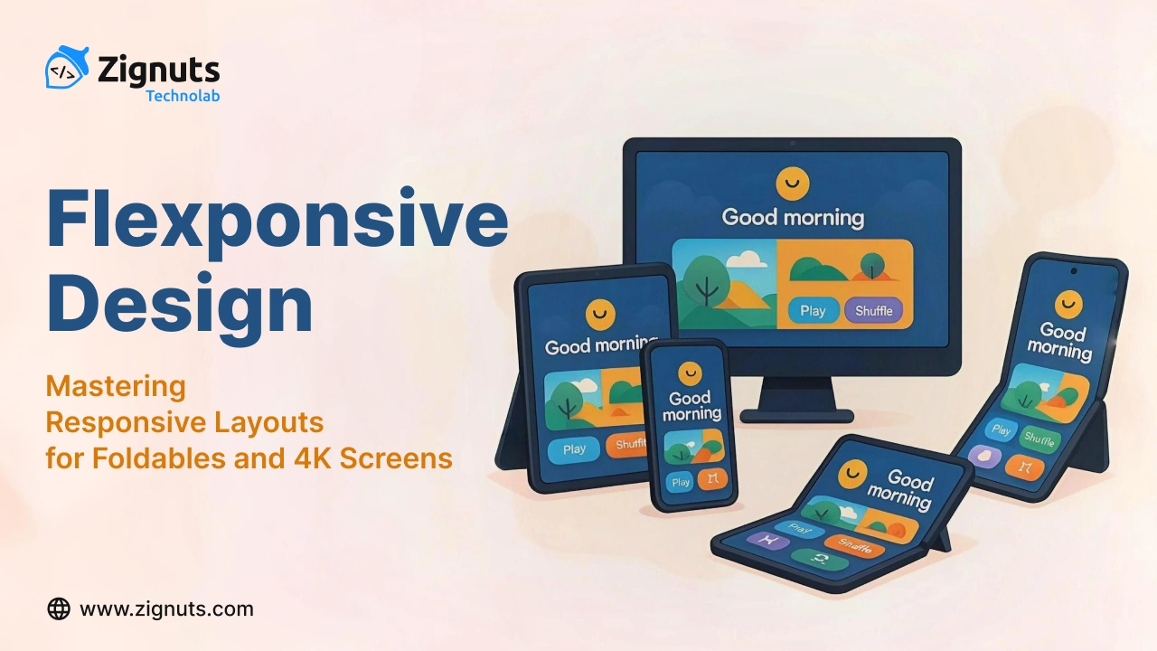
The web is no longer just fluid, it’s folding. And stretching. And exploding onto massive ultra-HD screens. Welcome to the age of Flexponsive Design — where the challenge isn’t just responsiveness, it’s adaptability across extreme aspect ratios, split screens, and foldable transitions.
As modern users interact with websites on a dizzying variety of devices — from Z Folds and Surface Duos to 49" ultrawide monitors, traditional responsive methods fall short. Flexponsive Design offers a new frontier: building UI that’s intelligent, posture-aware, and immersive across unpredictable form factors.
What is Flexponsive Design?
Flexponsive Design is an evolved responsive strategy that anticipates non-linear screen behaviours such as folding, spanning, stretching beyond 4K, or rotating to portrait mode on oversized touch displays.
In short, it’s a way of designing digital experiences for the real world, not just the one imagined by desktop-first or mobile-first philosophies.
Why "Flexponsive"?
The term “Flexponsive” blends flexibility with responsiveness. It’s about creating UI that doesn’t just shrink and grow, it reconfigures, reorganizes, and reacts to the dynamic environments that new devices introduce.
This includes:
- Foldables (e.g., Galaxy Z Fold, Surface Duo, Pixel Fold)
- 4K & ultrawide monitors (3440px+, 21:9 or even 32:9)
- Rotating touch displays (portrait mode smart TVs, kiosks)
- Dual-screen/multi-pane devices
- Touch + pen hybrid workflows
Why Traditional Responsive Design Falls Short
Classic responsive design workflows rely heavily on device width (e.g., 768px, 1280px) to trigger layout changes. But modern devices have:
- Variable postures (folded, unfolded, tabletop)
- Multiple active screens (dual displays)
- Massive screen real estate, leading to layout drift
- Input shifts (pen, finger, stylus, keyboard)
For example:
- A Z Fold user may begin in compact phone mode, then unfold to tablet size mid-session.
- A 4K user might open your site in a third of the screen, creating a narrow view akin to a tablet.
- An enterprise user might split the app into two resizable vertical columns across screens.
Designing for these edge cases is no longer optional — it’s essential.
Challenges in the Wild
1. Fold Transitions (Device Posture)
When foldables change state (e.g., from phone to tablet), your layout might split, reposition, or distort. DOM elements may become unreadable or misaligned.
✅ Use:
✅ Test with: Chrome DevTools → Dual Screen emulator
✅ React dynamically with: window.getWindowSegments() (coming to more browsers)
2. Excessive Whitespace on 4K/Ultrawide Screens
Full-width layouts can look broken or "empty" on ultra-wide displays. Key issues include:
- Poor line readability
- Low content density
- Disconnected design rhythm
✅ Use:
- max-width on containers
- Optimal line lengths (50–75 characters)
- Whitespace framing with CSS Grid
✅ Enhance with container queries to allow adaptive nested layouts.
3. Dual-Screen Context Conflicts
One screen may be used for navigation, the other for content. Without posture-aware logic, your UX can feel fragmented.
✅ Use:
- Progressive disclosure for UI modules
- Split UI logic (left = menu, right = content)
- Avoid fixed assumptions about single-direction layout flows
4. Non-Traditional Viewports (Portrait TVs, Rotating Monitors)
Vertical screens aren’t always mobile-sized. Digital signage and vertical tablets may run 1080x1920 or higher.
✅ Use:
✅ Avoid using width-based breakpoints only — design for aspect ratio + context.
Flexponsive Design Principles
1. Aspect-Aware Breakpoints
css
Adapt to shape, not just size.
2. Container Queries for Local Responsiveness
Let components resize relative to their parent:
css
3. Layout Fluidity + Behavioral Flexibility
Use CSS Grid, Flexbox, and JavaScript to switch layout behaviours on the fly based on device state.
4. Intentional Constraints
Design for legibility and content focus:
- Use max-width constraints
- Balance whitespace
- Avoid edge-to-edge design unless contextually relevant
5. Posture-Aware Components
Use the Window Segments API and navigator.userAgentData to detect foldable status and posture shifts.
Tools for Testing Flexponsive Layouts
- Chrome DevTools → Dual-screen emulation
- Microsoft Surface Duo Emulator
- Foldable.dev → Foldable testing resources
- BrowserStack / LambdaTest → Multi-device environments
- Simulate ultrawide screens with custom viewports
Real-World Use Cases
EdTech Platforms
Adapt content flow based on reading posture: collapsed vs expanded screen.
E-commerce
Show split product images and descriptions on dual screens; optimize cart/checkout experience for vertical screen splits.
Enterprise Dashboards
Avoid overwhelming users with sprawling graphs. Use whitespace tactically and trigger layout stacking on fold/open events.
Digital Art & Note-Taking
Design a touch + pen hybrid UI that realigns based on user hand position and screen angle.
Final Thoughts: Designing for the Weird and Wide
Flexponsive Design isn’t just another buzzword — it’s the new normal. As devices become more experimental, designers and developers must embrace fluid, posture-aware, context-sensitive UI systems.
Design not just for what fits, but for how it moves.
Not just for screen sizes, but for screen behaviors.
Because in 2025, the next breakpoint isn’t just a pixel — it’s a hinge, angle, or interaction mode.


.webp)
.webp)
.webp)
.png)
.png)
.webp)
.webp)
.webp)
