The digital landscape of 2026 has moved far beyond simple utility. Users no longer just look for apps that work; they seek platforms that feel alive, responsive, and deeply connected to their personal context. With the full-scale rollout of this latest framework, Google has bridged the gap between rigid design systems and fluid, human emotion. This evolution marks a shift from interfaces that are merely seen to experiences that are truly felt.
This transformation is rooted in over three years of intensive behavioral research involving more than 18,000 global participants. The findings were clear: people crave digital environments that possess "personality" and "warmth" rather than clinical efficiency. By integrating advanced motion physics and a revamped shape library, the system now allows for a level of artistic expression previously reserved for custom-coded luxury sites. Whether it is the subtle spring of a button that feels tactile or a layout that morphs to mirror a user's evening mood, every element is designed to foster a genuine sense of delight. This isn't just an aesthetic polish; it is a strategic effort to reduce cognitive load and eliminate the "flat design" fatigue that has dominated the last decade, making technology feel like a natural extension of the human experience.
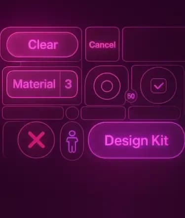
The Evolution of Material Design Expressive
In the early days of design systems, the focus was on consistency and structure. We saw the birth of flat design, followed by the tactile physics of the original 2014 launch. By the early 2020s, personalization became the priority, allowing software to take on the hues of a user’s wallpaper. Today, the philosophy has matured into something far more sophisticated. It is no longer just about reflecting a user's color palette; it is about reflecting their current state of mind and the unique spirit of a brand simultaneously.

Milestones of the Material Journey
The road to the current era has been defined by three distinct shifts in how we perceive digital surfaces:
- Material 1 (2014): The Foundation of Digital Physics
This era introduced "Quantum Paper," a concept where digital elements occupied 3D space with realistic shadows and lighting. It replaced the visual chaos of the early web with a predictable, grid-based logic that made mobile interfaces intuitive for the first time.
- Material 2 (2018): The Rise of Brand Customization
As apps began to look too similar, Google introduced Material Theming. This allowed companies to move away from the "standard Google look" by introducing custom corner radii, specialized typography, and flexible color swatches that prioritized brand identity without breaking the underlying usability rules.
- Material 3 (2021): The Personalization Revolution
Known as "Material You," this version handed the keys to the user. Through dynamic color algorithms, an entire OS could adapt its color scheme to match a personal photo or wallpaper, making the device feel like a unique, living accessory rather than a static tool.
Why "Expressive" is the 2026 Standard
The shift to the current framework was born out of a realization that "clean" design had become "sterile" design. Extensive research with over 18,000 participants revealed that users, especially younger generations, interact 4x faster with interfaces that use bold, expressive cues.
- Beyond Easing: The Motion Physics System
We have moved past simple "ease-in" and "ease-out" curves. The new system uses spring-based physics, where buttons and cards have "weight" and "tension." When you pull a list, it doesn't just bounce; it stretches and settles with the natural grace of physical material.
- The Shape Library Expansion
Designers now have access to 35+ iconic shapes that go beyond the standard rounded rectangle. These shapes are used to create "Hero Moments" sections of an app that break the grid to grab attention and evoke a specific mood, such as the energetic wiggles of a fitness tracker or the grounded, stable polygons of a banking app.
- The HCT Color Science
By utilizing the Hue-Chroma-Tone (HCT) color space, the system ensures that even the most vibrant and expressive color choices maintain perfect accessibility and contrast. This allows for "Vibrant Theming," where apps can be incredibly colorful without ever becoming unreadable.
Core Pillars of Material Design Expressive
Sensory Interaction and Fluidity
Modern interfaces now move with a sense of purpose that mimics natural physics. Instead of standard fades or slides, elements grow, shrink, and shift with a weightiness that feels authentic. These micro-interactions act as silent guides, helping people navigate complex workflows without feeling overwhelmed. By treating digital components as physical objects with momentum, the system reduces the mental effort required to understand where one screen ends and another begins.
- Spring-Based Motion Physics: The standard easing curves of the past have been replaced by a physics engine that calculates mass and tension. When a user swipes a card, it responds with a realistic "spring" that matches the speed of their finger, making the software feel like a tangible, responsive material.
- Shape-Morphing Continuity: Buttons and containers are no longer static boxes. They can morph into new forms, such as a Floating Action Button (FAB) expanding into a full-screen menu using fluid transitions that maintain the user's focal point. This constant visual thread prevents "context switching" fatigue.
Brand Identity in a Flexible Ecosystem
One of the greatest challenges for companies used to be maintaining a unique identity while adhering to standardized system guidelines. The current framework solves this by offering high-fidelity customization. Brands can now bake their specific DNA from custom typography scales to proprietary motion curves directly into the foundation. This ensures that a luxury fashion app feels elegant and airy, while a high-speed trading platform feels sharp and instantaneous, even though both are built on the same underlying logic.
- Expressive Shape Library: With over 35 new geometric profiles, brands can move beyond rounded rectangles. An eco-friendly brand might use organic, leaf-like asymmetrical curves, while a tech firm might opt for sharp, precision-angled polygons to communicate speed and accuracy.
- Semantic Theming Tokens: Identity is now managed through "tokens" rather than hard-coded values. This allows a brand to update its entire visual language across mobile, web, and wearables by changing a single design variable, ensuring total consistency in every user touchpoint.
Adaptive Accessibility Standards
In 2026, inclusivity is a default state rather than a secondary thought. The system intelligently adjusts contrast ratios, haptic feedback intensity, and even animation speeds based on real-time environmental factors and user needs. Whether someone is using a device in bright sunlight or requires simplified layouts for cognitive ease, the interface reshapes itself dynamically. This ensures that the beauty of the design is accessible to every single person, regardless of their physical or situational constraints.
- Cognitive Load Management: For users with neurodivergent needs, the system can trigger "Calm Mode," which reduces motion intensity, simplifies decorative elements, and prioritizes essential text. This ensures that the "Expressive" nature of the design never becomes overstimulating.
- Environmental Responsiveness The UI monitors ambient light and noise. In high-glare outdoor settings, the system automatically shifts to a high-contrast "Solar Theme." In noisy environments, visual feedback (like glowing borders) replaces audio alerts to ensure critical information is never missed.
Content Containment and Hierarchy
Structure is the secret to clarity. The new framework utilizes "Expressive Containers" to group related information visually, making the interface scannable even at a glance.
- Editorial Typography: By utilizing variable fonts, the system can dynamically adjust weight and width to create "hero moments." This allows important headlines to expand and command attention, similar to a high-end magazine layout, guiding the eye naturally toward the most critical action.
- Visual Grouping Logic: Using size and spacing as active design tools, the framework helps users distinguish between primary tasks and secondary information. This "spatial mapping" ensures that even on small screens, the most important "Send" or "Buy" buttons are instantly recognizable.
Hire UI/UX Designers Today!

Technical Architecture of Material Design Expressive
Generative Theme Engines
The backend of modern design relies on a sophisticated variable system. Instead of hard-coding every pixel, developers now use intelligent tokens that respond to environmental triggers. A weather application might shift its entire visual weight from a light, energetic vibe during a sunny morning to a deep, grounded aesthetic during a stormy evening. This happens globally across all platforms, web, mobile, and wearables, ensuring a seamless transition as the user moves between devices.
- Dynamic Design Tokens: By utilizing the Hue-Chroma-Tone (HCT) color space, tokens no longer represent static hex codes. Instead, they are semantic instructions. When a "Primary Container" token is called, the engine calculates the optimal contrast and vibrancy based on the user's current theme, ensuring that accessibility is mathematically guaranteed even in highly expressive, neon, or experimental palettes.
- Platform-Agnostic Synchronization: The framework uses a unified JSON-based configuration that bridges the gap between different coding environments. Whether a team is using Jetpack Compose for Android, Flutter for cross-platform, or advanced CSS variables for the web, the "Brand DNA" remains consistent. A change to a single corner-radius token in the design file automatically propagates through the entire development pipeline.
AI-Augmented Layout Logic
Machine learning now plays a silent but pivotal role in how screens are composed. The system analyzes interaction frequency to subtly emphasize the tools you use most while tucking away the ones you don’t. This predictive behavior creates a "living" interface that grows more efficient the more you interact with it. It’s not about moving buttons around randomly; it’s about a calculated refinement of space that maximizes productivity and minimizes frustration.
- Predictive Component Scaling Using on-device intelligence, the layout engine can identify high-priority actions in real-time. For instance, if a user frequently uses a specific "Quick Pay" feature at a certain time of day, the button may subtly increase in scale or gain a more vibrant "Expressive" glow to reduce the time spent searching for it.
- Automated Accessibility Refinement Integrated AI models, such as Gemini-optimized scanners, work in the background to ensure every generated layout is inclusive. This includes real-time generation of descriptive alt-text for dynamic images and the optimization of VoiceOver hierarchies, allowing the interface to adapt its structure for screen readers without requiring manual developer intervention.
Motion Physics and Edge Computing
The transition from simple animation to "Living Motion" is powered by a new spring-physics engine that runs at the hardware level.
- Interruptible Transitions Users no longer have to wait for an animation to finish before they can interact with the next element. The physics-based system allows for "Retargeting," where an object in motion can seamlessly change direction mid-flight if the user provides a new gesture, making the UI feel weightless and instantaneous.
- Context-Aware Render Pipelines: The system uses edge computing to predict which animations to pre-render. By analyzing the user's typical navigation path, the interface prepares the "Expressive" morphing effects before the user even taps, eliminating "jank" and ensuring a fluid 120Hz experience on any compatible device.
Business Growth through Material Design Expressive
Companies adopting these principles are seeing a direct correlation between design quality and commercial success. When a product feels intuitive and emotionally resonant, users stay longer and return more often. In sectors like fintech, this translates to increased trust; in e-commerce, it results in higher conversion rates as the checkout process becomes a frictionless, supportive journey rather than a technical hurdle.
Quantifiable Impact on User Engagement
The transition to a more expressive UI is not just a cosmetic choice; it is a data-driven strategy. Research across thousands of global users shows that expressive layouts can help people identify key interactive elements up to 4x faster. For a business, this speed directly reduces "bounce rates" as users find value immediately without the hesitation caused by over-simplified, flat designs.
- Increased Desirability and Brand Loyalty: Data indicates a 34% boost in brand modernity and a 32% increase in subculture perception when using these principles. By moving away from sterile, "one-size-fits-all" interfaces, brands can foster a deeper emotional connection, turning casual users into loyal advocates who view the software as a personalized extension of their lifestyle.
- Higher Conversion through Visual Hierarchy: By utilizing the new expanded shape library and "Hero Moments," businesses can guide the user’s eye precisely toward call-to-action buttons. Strategic use of color and motion has been shown to improve click-through rates by 15%, as the interface proactively rewards user interaction with delightful, tactile feedback.
Sector-Specific ROI
The business benefits vary by industry, but the common thread is a significant reduction in friction and an increase in user confidence.
- E-commerce: Dynamic Shopping Contexts Retail apps are seeing a marked rise in average order value by using "Expressive Theming" that adapts to the time of day or seasonal promotions. For example, a "Golden Hour" theme that activates during peak evening shopping times can create an urgent yet warm atmosphere that encourages exploration and discovery.
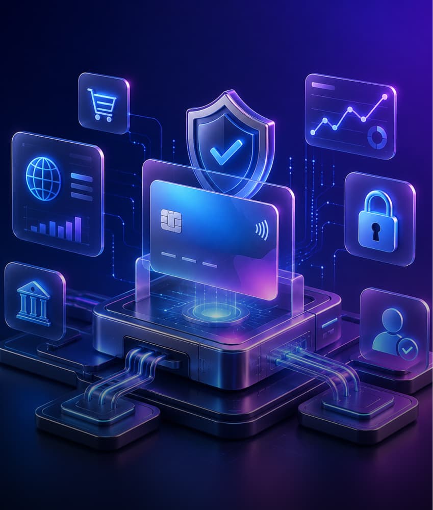
- Fintech: Building Security through Clarity: In financial services, where uncertainty leads to abandoned transactions, expressive design uses "Confidence-Inspiring Dashboards." By using purposeful motion to explain complex data shifts and clear visual containment for sensitive forms, apps can reduce user anxiety, leading to a more stable and profitable user base.
- Healthcare: Reducing Patient Friction: Wellness and medical platforms use "Calm Mode" and organic shapes to reduce the stress of digital interactions. When patients feel more comfortable with an interface, they are more likely to complete health logs and follow-up tasks, leading to better outcomes and higher retention for the provider.
Implementation Roadmap for Modern Development
Strategic Migration from Legacy Systems
Adopting this framework does not require a complete overnight overhaul. Successful 2026 enterprises are following a phased migration strategy. By first updating high-impact "Hero" screens, companies can test user sentiment before scaling the expressive language across the entire application. This modular approach allows for technical debt management while providing immediate visual value to the end-user.
- The "Hero Moment" Pilot: Identify the core user journey, such as the "Check Out" screen in retail or "Transaction Success" in banking. By applying expressive motion and shape morphing to these singular points first, brands can measure a 4x increase in element recognition before committing to a full-system update.
- Token-First Integration: Instead of replacing every component, developers start by swapping hard-coded values for dynamic spring and color tokens. This ensures that the underlying architecture is "Expressive-ready," allowing for a gradual rollout that maintains perfect visual parity during the transition.
Bridging Design and Engineering Silos
The current era of design requires a closer collaboration than ever before. With "Live Sync" plugins between design tools like Figma and development IDEs, the handoff process has been replaced by a continuous feedback loop. Designers now provide motion parameters and physics values, not just static PNGs. This ensures that the final product behaves exactly as envisioned, with no loss of "expressivity" during the translation to code.
- Live Component Mirroring: Engineering teams can now pull the latest "Material Design Expressive" components directly from Figma into Jetpack Compose or Flutter environments. This eliminates the "design-to-dev" gap, as the physics-based spring tokens are standardized across both platforms.
- Collaborative Physics Debugging: Developers and designers now use shared inspector tools to fine-tune "Stiffness" and "Damping" values in real-time. This iterative process ensures that the "bounce" of a button feels premium and intentional, rather than a generic animation preset.
Continuous User Validation Loops
Implementation in 2026 is an ongoing conversation with the user. The roadmap includes automated eye-tracking and sentiment analysis during the beta phase to ensure that the new "Vibrant" elements are enhancing usability rather than creating a distraction.
- A/B Testing for Emotional Resonance: Brands are running concurrent versions of apps to see which expressive tactics, like editorial typography or organic shape containers, result in higher NPS scores.
- Iterative Accessibility Audits: The roadmap mandates automated checks via the Gemini-integrated dev tools. These audits verify that as the interface grows more expressive, it remains WCAG-compliant, automatically adjusting contrast and motion for users with varying visual sensitivities.
Hire UI/UX Designers Today!
Ethical Design and Data Privacy in the Expressive Era
Balancing Engagement with Digital Wellbeing
As interfaces become more "alive" and emotionally resonant, there is a fine line between delight and distraction. The 2026 framework introduces native "Focus Safeguards" to ensure that expressive design does not lead to digital addiction or overstimulation.
- Passive Haptic Throttling: When the system detects prolonged usage during late-night hours, it subtly dampens the "expressive" haptic feedback and slows down spring animations to encourage a calmer, more mindful interaction.
- Intent-Based Motion: The engine distinguishes between "High-Value Interaction" (completing a task) and "Passive Browsing." It reduces visual flair during critical tasks to keep the user focused, reserving the most vibrant animations for success states and rewarding milestones.
- Circadian UI Harmonization: Beyond mere dark mode, the system gradually shifts its "visual weight." As the day ends, the framework automatically simplifies complex gradients and reduces the frequency of motion alerts, helping the user’s brain transition away from high-energy digital stimulation toward rest.
Privacy-First Personalization
In an era where design adapts to the user's "state of mind," data privacy is paramount. The current architecture ensures that the behavioral analysis used to power "Expressive" changes happens entirely on-device.
- Local Processing of Mood Cues: Factors like device orientation, speed, swipe pressure, and ambient environmental data are processed locally via on-device ML. This means the system can adapt the UI to your stress levels or environment without ever sending sensitive behavioral data to a cloud server.
- Transparent Adaptive Logic: Users are provided with an "Expressive Dashboard" where they can see why the UI is changing. Whether it's shifting colors for sunlight or simplifying layouts due to high interaction frequency, the user remains in total control of how much "personality" their interface displays.
- Zero-Knowledge Style Sync: When a user carries their theme across devices, the synchronization uses end-to-end encrypted design tokens. The backend only sees numerical variables, not the personal photos or habits that generated those variables, ensuring that your digital identity remains strictly yours.
Sustainable Visual Performance
Expressivity should not come at the cost of device longevity or environmental impact. The framework includes ethical constraints on how hardware resources are utilized.
- Energy-Efficient Rendering: The engine monitors battery health and thermal limits. If a device is running low on power, the system gracefully degrades the complex physics animations to standard transitions, prioritizing core functionality over visual flair without breaking the user’s flow.
- Adaptive Refresh Rate Optimization: By syncing with modern 120Hz displays, the framework only utilizes high-frequency rendering for specific "Hero Moments." This ensures that the fluid beauty of the interface is delivered only when it enhances the experience, saving significant power during static content viewing.
Future-Proofing with Zignuts Technolab
Custom Design Token Strategy
At Zignuts, we don't just apply templates; we build unique design token systems tailored specifically to your business goals. Our approach begins with a deep analysis of your brand's core values, which we translate into a bespoke library of geometric shapes, custom motion curves, and HCT-compliant color palettes. This ensures that your digital product stands out in a crowded marketplace with a distinct personality while remaining perfectly functional and accessible across every device category. By anchoring your UI in a robust token-based architecture, we make your platform inherently adaptable to future design shifts, allowing for global visual updates without the need for extensive code rewrites.
Advanced Prototyping and User Validation
Before writing a single line of production code, our team utilizes high-fidelity prototypes that simulate the full range of motion physics and AI-driven interactions. This rigorous phase allows us to conduct in-depth usability testing to ensure that the "Delight" factor of your application actually translates into improved task completion and higher user satisfaction scores. We focus on validating the emotional resonance of the interface, ensuring that expressive elements serve a functional purpose rather than being mere decoration. This proactive validation cycle reduces development waste and guarantees that the final experience is as efficient as it is beautiful.
End-to-End Development Integration
Our expertise extends beyond the design canvas and into the core engineering of your product. We specialize in bridging the gap between creative vision and technical execution by implementing real-time sync workflows between design environments and development frameworks like Flutter and Jetpack Compose. This integrated philosophy means that the fluidity and responsiveness defined in the design phase are preserved exactly in the final build. By partnering with Zignuts, you gain a team that understands how to leverage the full technical architecture of modern design systems to drive measurable business growth and foster lasting user loyalty.
Conclusion
The launch of Material Design Expressive signifies a pivotal moment where technology finally learns to speak the language of human emotion. By merging advanced AI capabilities with fluid motion physics and adaptive aesthetics, Google has provided the tools to build digital environments that are not only efficient but deeply meaningful. For businesses, this means an opportunity to transcend basic utility and create products that foster genuine trust and long-term engagement. As we move further into 2026, the success of a digital product will be defined by its ability to adapt, resonate, and express, proving that the most powerful interfaces are the ones that feel the most human.
To ensure your product leads this new era of digital interaction, you need a partner who understands the technical and emotional nuances of the current landscape. When you choose to Hire UI/UX Designers from Zignuts, you are investing in a future-ready vision that prioritizes both user delight and commercial performance. Let’s collaborate to transform your application into a vibrant, expressive experience that sets your brand apart.
Ready to start your journey? Contact Zignuts today to discuss your vision with our expert team and build the next generation of design together.

Chetan Singadia
Crafting meaningful digital experiences through strategic design thinking, user empathy, and a relentless commitment to visual and functional excellence.
