# Convert Figma Design to React.js + Material-UI Application
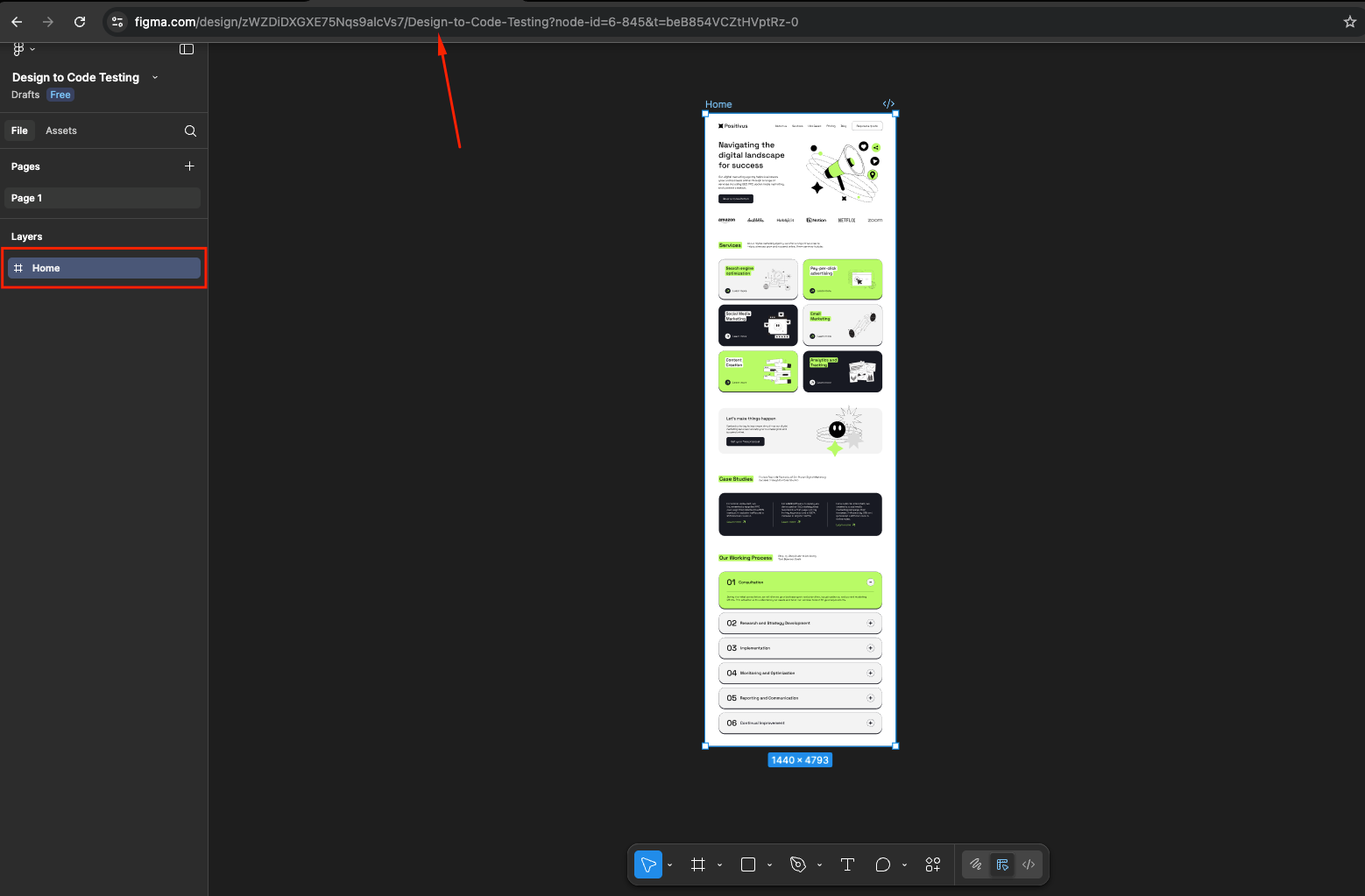
Convert this Figma design into a fully functional React.js application using Material-UI: https://www.figma.com/design/zWZDiDXGXE75Nqs9alcVs7/Design-to-Code-Testing?node-id=6-845&t=pyP3dXN75kx27lY9-0
## Requirements
### Project Structure & Architecture
- I have already created a React Vite app and have already done the setup of Material-UI (MUI)
- Implement proper folder structure following React best practices
- Use functional components with React Hooks
- Leverage MUI's component system and theming capabilities
- Ensure proper component composition and reusability
### Package Dependencies
```json
{
"@emotion/react": "^11.14.0",
"@emotion/styled": "^11.14.1",
"@fontsource/roboto": "^5.2.8",
"@mui/icons-material": "^7.3.2",
"@mui/material": "^7.3.2",
"react": "^19.1.1",
"react-dom": "^19.1.1"
}
```
### Folder Structure
```
src/
├── components/
│ ├── layout/ # Layout components
│ │ ├── Header.jsx
│ │ ├── Footer.jsx
│ │ ├── Navigation.jsx
│ │ ├── Sidebar.jsx
│ │ └── index.js
│ ├── sections/ # Page sections
│ │ ├── Hero.jsx
│ │ ├── Features.jsx
│ │ ├── Testimonials.jsx
│ │ └── index.js
│ └── common/ # Common components
│ ├── Loading.jsx
│ ├── ErrorBoundary.jsx
│ └── index.js
├── pages/ # Page components
│ ├── Home.jsx
│ ├── About.jsx
│ ├── Contact.jsx
│ └── index.js
├── hooks/ # Custom React hooks
│ ├── useToggle.js
│ ├── useMediaQuery.js
│ ├── useLocalStorage.js
│ └── index.js
├── theme/ # MUI theme configuration
│ ├── index.js
│ ├── palette.js
│ ├── typography.js
│ └── components.js
├── utils/ # Utility functions
│ ├── constants.js
│ ├── helpers.js
│ └── index.js
├── styles/ # Additional custom styles
│ ├── globals.css
│ └── muiOverrides.js
└── App.jsx # Main App component
```
### MUI Theme & Styling System
- **Custom Theme**: Create a comprehensive MUI theme matching Figma design
- **Typography**: Define custom typography scales using MUI's typography system
- **Color Palette**: Map Figma colors to MUI palette structure
- **Component Overrides**: Use MUI's component override system for custom styling
- **Responsive Design**: Utilize MUI's breakpoint system and responsive utilities
- **Design Tokens**: Implement consistent spacing, shadows, and border radius
### MUI Breakpoints
```javascript
// MUI Default Breakpoints
const breakpoints = {
xs: 0, // Extra small devices
sm: 600, // Small devices
md: 900, // Medium devices
lg: 1200, // Large devices
xl: 1536 // Extra large devices
};
```
### Component Development with MUI
- Build custom components extending MUI base components
- Use MUI's `sx` prop for component-level styling
- Implement proper theme integration with `useTheme` hook
- Leverage MUI's built-in accessibility features
- Create compound components using MUI patterns
### Theme Configuration
#### theme/index.js
```javascript
import { createTheme } from '@mui/material/styles';
import palette from './palette';
import typography from './typography';
import components from './components';
const theme = createTheme({
palette,
typography,
components,
spacing: 8, // 8px base spacing unit
shape: {
borderRadius: 8,
},
shadows: [
'none',
'0px 2px 4px rgba(0, 0, 0, 0.1)',
'0px 4px 8px rgba(0, 0, 0, 0.12)',
// ... custom shadow definitions
],
});
export default theme;
```
#### theme/palette.js
```javascript
const palette = {
mode: 'light',
primary: {
main: '#1976D2', // Match your Figma primary color
light: '#42A5F5',
dark: '#1565C0',
contrastText: '#FFFFFF',
},
secondary: {
main: '#DC004E', // Match your Figma secondary color
light: '#E91E63',
dark: '#C51162',
contrastText: '#FFFFFF',
},
error: {
main: '#D32F2F',
light: '#EF5350',
dark: '#C62828',
},
warning: {
main: '#ED6C02',
light: '#FF9800',
dark: '#E65100',
},
info: {
main: '#0288D1',
light: '#03DAC6',
dark: '#0277BD',
},
success: {
main: '#2E7D32',
light: '#4CAF50',
dark: '#1B5E20',
},
grey: {
50: '#FAFAFA',
100: '#F5F5F5',
200: '#EEEEEE',
300: '#E0E0E0',
400: '#BDBDBD',
500: '#9E9E9E',
600: '#757575',
700: '#616161',
800: '#424242',
900: '#212121',
},
background: {
default: '#FFFFFF',
paper: '#FFFFFF',
},
text: {
primary: 'rgba(0, 0, 0, 0.87)',
secondary: 'rgba(0, 0, 0, 0.6)',
disabled: 'rgba(0, 0, 0, 0.38)',
},
};
export default palette;
```
#### theme/typography.js
```javascript
const typography = {
fontFamily: [
'"Inter"',
'"Roboto"',
'"Helvetica Neue"',
'Arial',
'sans-serif',
].join(','),
// Custom typography variants matching Figma
h1: {
fontSize: '3.5rem',
fontWeight: 700,
lineHeight: 1.2,
letterSpacing: '-0.01562em',
},
h2: {
fontSize: '2.75rem',
fontWeight: 600,
lineHeight: 1.3,
letterSpacing: '-0.00833em',
},
h3: {
fontSize: '2.25rem',
fontWeight: 600,
lineHeight: 1.4,
letterSpacing: '0em',
},
h4: {
fontSize: '1.75rem',
fontWeight: 500,
lineHeight: 1.4,
letterSpacing: '0.00735em',
},
h5: {
fontSize: '1.5rem',
fontWeight: 500,
lineHeight: 1.5,
letterSpacing: '0em',
},
h6: {
fontSize: '1.25rem',
fontWeight: 500,
lineHeight: 1.5,
letterSpacing: '0.0075em',
},
subtitle1: {
fontSize: '1rem',
fontWeight: 500,
lineHeight: 1.6,
letterSpacing: '0.00938em',
},
subtitle2: {
fontSize: '0.875rem',
fontWeight: 500,
lineHeight: 1.6,
letterSpacing: '0.00714em',
},
body1: {
fontSize: '1rem',
fontWeight: 400,
lineHeight: 1.6,
letterSpacing: '0.00938em',
},
body2: {
fontSize: '0.875rem',
fontWeight: 400,
lineHeight: 1.6,
letterSpacing: '0.01071em',
},
button: {
fontSize: '0.875rem',
fontWeight: 600,
lineHeight: 1.4,
letterSpacing: '0.02857em',
textTransform: 'none', // Remove uppercase transform
},
caption: {
fontSize: '0.75rem',
fontWeight: 400,
lineHeight: 1.4,
letterSpacing: '0.03333em',
},
overline: {
fontSize: '0.75rem',
fontWeight: 700,
lineHeight: 1.4,
letterSpacing: '0.08333em',
textTransform: 'uppercase',
},
};
export default typography;
```
## Template Structure
### App.jsx
```jsx
import React from 'react';
import { ThemeProvider } from '@mui/material/styles';
import { CssBaseline, Box } from '@mui/material';
import theme from './theme';
import { Header, Footer } from './components/layout';
import { Home } from './pages';
function App() {
return (
<ThemeProvider theme={theme}>
<CssBaseline />
<Box sx={{ minHeight: '100vh', display: 'flex', flexDirection: 'column' }}>
<Header />
<Box component="main" sx={{ flexGrow: 1 }}>
<Home />
</Box>
<Footer />
</Box>
</ThemeProvider>
);
}
export default App;
```
### Custom MUI Component Example
```jsx
import React from 'react';
import { Button as MuiButton, useTheme } from '@mui/material';
import { styled } from '@mui/material/styles';
// Styled component approach
const StyledButton = styled(MuiButton)(({ theme, variant }) => ({
borderRadius: theme.shape.borderRadius * 2,
padding: theme.spacing(1.5, 3),
fontWeight: 600,
textTransform: 'none',
boxShadow: 'none',
'&:hover': {
boxShadow: theme.shadows[4],
transform: 'translateY(-1px)',
},
...(variant === 'gradient' && {
background: 'linear-gradient(45deg, #FE6B8B 30%, #FF8E53 90%)',
color: 'white',
'&:hover': {
background: 'linear-gradient(45deg, #FE6B8B 60%, #FF8E53 100%)',
},
}),
}));
// Custom Button Component
const CustomButton = ({
children,
variant = 'contained',
size = 'medium',
color = 'primary',
fullWidth = false,
startIcon,
endIcon,
onClick,
disabled = false,
...props
}) => {
const theme = useTheme();
return (
<StyledButton
variant={variant}
size={size}
color={color}
fullWidth={fullWidth}
startIcon={startIcon}
endIcon={endIcon}
onClick={onClick}
disabled={disabled}
{...props}
>
{children}
</StyledButton>
);
};
// Alternative: Using sx prop approach
const CustomButtonWithSx = ({ children, ...props }) => {
return (
<MuiButton
sx={{
borderRadius: 2,
px: 3,
py: 1.5,
fontWeight: 600,
textTransform: 'none',
boxShadow: 'none',
'&:hover': {
boxShadow: 4,
transform: 'translateY(-1px)',
},
// Responsive styles
[theme => theme.breakpoints.down('sm')]: {
px: 2,
py: 1,
fontSize: '0.875rem',
},
}}
{...props}
>
{children}
</MuiButton>
);
};
export default CustomButton;
```
### Layout Component with MUI
```jsx
import React, { useState } from 'react';
import {
AppBar,
Toolbar,
Typography,
Button,
IconButton,
Drawer,
List,
ListItem,
ListItemText,
ListItemButton,
Box,
Container,
useTheme,
useMediaQuery,
} from '@mui/material';
import {
Menu as MenuIcon,
Close as CloseIcon,
Home as HomeIcon,
Info as InfoIcon,
Contact as ContactIcon,
} from '@mui/icons-material';
const Header = () => {
const [mobileOpen, setMobileOpen] = useState(false);
const theme = useTheme();
const isMobile = useMediaQuery(theme.breakpoints.down('md'));
const handleDrawerToggle = () => {
setMobileOpen(!mobileOpen);
};
const navItems = [
{ label: 'Home', icon: HomeIcon, href: '/' },
{ label: 'About', icon: InfoIcon, href: '/about' },
{ label: 'Contact', icon: ContactIcon, href: '/contact' },
];
const drawer = (
<Box sx={{ width: 250 }}>
<Box sx={{ p: 2, display: 'flex', justifyContent: 'flex-end' }}>
<IconButton onClick={handleDrawerToggle}>
<CloseIcon />
</IconButton>
</Box>
<List>
{navItems.map((item) => (
<ListItem key={item.label} disablePadding>
<ListItemButton>
<item.icon sx={{ mr: 2 }} />
<ListItemText primary={item.label} />
</ListItemButton>
</ListItem>
))}
</List>
</Box>
);
return (
<>
<AppBar
position="sticky"
elevation={1}
sx={{
bgcolor: 'background.paper',
color: 'text.primary',
}}
>
<Container maxWidth="lg">
<Toolbar sx={{ px: { xs: 0 } }}>
<Typography variant="h6" component="div" sx={{ flexGrow: 1 }}>
Your Logo
</Typography>
{isMobile ? (
<IconButton
color="inherit"
aria-label="open drawer"
edge="start"
onClick={handleDrawerToggle}
>
<MenuIcon />
</IconButton>
) : (
<Box sx={{ display: 'flex', gap: 2 }}>
{navItems.map((item) => (
<Button
key={item.label}
color="inherit"
startIcon={}
sx={{
textTransform: 'none',
fontWeight: 500,
}}
>
{item.label}
</Button>
))}
</Box>
)}
</Toolbar>
</Container>
</AppBar>
<Drawer
variant="temporary"
open={mobileOpen}
onClose={handleDrawerToggle}
ModalProps={{
keepMounted: true, // Better open performance on mobile
}}
sx={{
display: { xs: 'block', md: 'none' },
'& .MuiDrawer-paper': { boxSizing: 'border-box', width: 250 },
}}
>
{drawer}
</Drawer>
</>
);
};
export default Header;
```
## Key MUI Features to Utilize
### 1. Theme System
- Custom color palettes matching Figma design
- Typography scales and font families
- Spacing and shape configurations
- Component style overrides
### 2. Responsive Design
- MUI's breakpoint system
- Responsive typography
- Grid system for layouts
- Container component for proper content width
### 3. Component Library
- Pre-built accessible components
- Consistent design language
- Built-in animations and interactions
- Form components with validation
### 4. Styling Solutions
- `sx` prop for component-level styling
- `styled` components for reusable styled elements
- `useTheme` hook for accessing theme values
- CSS-in-JS with Emotion
### 5. Icons and Assets
- Material Icons (@mui/icons-material)
- Consistent icon sizing and theming
- Integration with MUI components
## Deliverables
Provide a complete, production-ready React.js + MUI application that includes:
1. **Complete MUI theme configuration** matching Figma design colors, typography, and spacing
2. **Responsive components** built with MUI's grid system and breakpoints
3. **Custom component library** extending MUI base components
4. **Proper MUI integration** using theme system and responsive utilities
5. **Pixel-perfect implementation** matching the Figma design using MUI styling solutions
6. **Smooth animations** using MUI's built-in transitions and custom animations
7. **Accessibility compliance** leveraging MUI's built-in accessibility features
8. **Performance optimized** code following MUI best practices
9. **Clean, maintainable code** with proper MUI patterns and documentation
The final deliverable should be a modern, responsive React.js + MUI application that not only matches the Figma design perfectly but also leverages MUI's powerful component system and theming capabilities for maintainable, scalable code.


