


.svg)

.svg)


.svg)
.svg)


.png)
Introduction
So you want to build a modern, good-looking web app - but you don't want to spend hours wrestling with CSS or reinventing the wheel for every button and dialog box. That's exactly what this guide covers.
In this tutorial, we're going to walk through how to set up a SvelteKit project and supercharge it with Shadcn-Svelte, a collection of beautiful, accessible UI components that drop right into your project. We'll cover everything from installation to adding components and setting up dark mode.
Whether you're brand new to Svelte or you've played around with it a bit, this guide is written for you. I'll keep things clear and practical.
What you'll need before starting:
- Node.js installed (^20.19.0 || ^22.13.0 || >=24)
- A code editor (VS Code works great)
- Basic familiarity with HTML, CSS, and JavaScript
We’ll create a clean and modern Hero section featuring a smooth Light/Dark mode toggle for a better user experience.
What is Svelte?
If you've used React or Vue before, you already understand the idea of a component-based JavaScript framework: a tool that helps you build UIs by breaking them into reusable pieces.
Svelte does the same thing, but with a twist: it compiles your code at build time instead of running a framework in the browser.
Most frameworks ship a runtime: a chunk of JavaScript that runs in the browser and manages your UI. Svelte doesn't do that. Instead, when you build your project, Svelte converts your components into lean, optimized plain JavaScript. The result is faster load times, smaller bundle sizes, and generally snappier apps.
Here's what Svelte looks like:
That's it. No useState, no imports from a library, just clean, readable code that does exactly what it looks like.
SvelteKit is the official full-stack framework built on top of Svelte. Think of it the same way you'd think of Next.js for React. It adds things like:
- File-based routing - create a file, get a route automatically
- Server-side rendering (SSR) and static site generation (SSG)
- API routes - write backend logic right inside your project
- Layouts - share a common header/footer across multiple pages easily
Bottom line: Svelte is the UI layer, and SvelteKit is the full framework you'll actually build your app with.
What is Shadcn UI?
If you've used React, you might know Shadcn UI, it got popular for one reason: instead of installing a component library as a black-box dependency, you copy the component code directly into your project.
This means you own the code. You can read it, modify it, and style it however you want, no fighting with library internals or overriding deeply nested CSS classes.
Shadcn-Svelte is the Svelte port of that same idea. It gives you a set of beautifully designed, fully accessible components built on top of:
- Bits UI - headless, accessible Svelte component primitives
- Tailwind CSS - utility-first CSS for styling
- tailwind-variants - for managing component style variants cleanly
The components include things like buttons, dialogs, dropdowns, accordions, forms, tooltips, and much more, all styled consistently and ready to use out of the box.
The key difference from other UI libraries: You're not importing from node_modules. The component files live in your src/lib/components/ui/ folder. They're yours to keep and customize.
Setup SvelteKit
Let's get a SvelteKit project up and running. Open your terminal and follow these steps.
Step 1: Create a new SvelteKit project
You'll be walked through a few prompts. Here's what to pick for this tutorial:
- Template: SvelteKit minimal
- Type checking: Yes, use TypeScript (recommended, but optional)
- Additional options: You can skip extras for now
Once it's done, navigate into your project:
Step 2: Install dependencies
Step 3: Start the development server
Open your browser and go to http://localhost:5173. You should see the default SvelteKit welcome page. Your project is alive!
Your project folder will look something like this:
The routes/ folder is where all your pages live. Every +page.svelte file becomes a URL route automatically. Simple and intuitive!
Setup Shadcn-Svelte
Now let's add Shadcn-Svelte to your project.
Step 1: Initialize Shadcn-Svelte
Run the following command in your project root:
You'll be asked a few setup questions:
- Which style would you like to use? : Default (recommended to start)
- Which color would you like to use as the base color? : Pick whatever you like (Slate, Gray, and Zinc are popular neutral choices)
- Where is your global CSS file? :
src/globale.css - Configure the import alias? : Press Enter to accept the default
$lib
This command will do several things for you automatically:
- Install and configure Tailwind CSS
- Create a
components.jsonconfig file in your project root - Add base CSS variables for theming to your
globale.css - Set up the component folder at
src/lib/components/ui/
Step 2: Check your globale.css
After init, open src/globale.css. You'll notice a bunch of CSS custom properties (variables) have been added — things like --background, --foreground, --primary, etc. These control your app's color scheme for both light and dark mode. You don't need to touch them right now, but it's great to know they're there and editable.
Step 3: Make sure your layout imports the CSS
Open src/routes/+layout.svelte. If it doesn't already import your global styles, add this:
That's all the setup needed. Shadcn-Svelte is initialized and ready to go!
Add a Component
Let's add some real components and see this all working together. We'll use a Button and an Accordion as our examples.
Adding a Button
Add the button component to your project using the Shadcn CLI:
This copies the button component files into src/lib/components/ui/button/. Now open src/routes/+page.svelte and try it out:
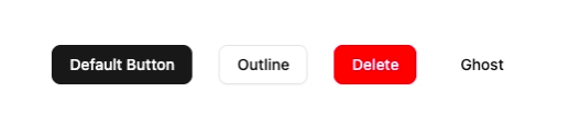
The variant prop lets you switch between different visual styles. Available variants are default, outline, ghost, destructive, secondary, and link. All the styling is handled via Tailwind under the hood, and since the button file is right in your project, you can open it and customize it any time you want.
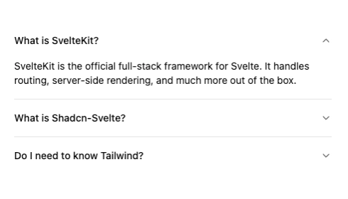
Adding an Accordion
The accordion is a perfect example of a more complex interactive component. Add it with:
Now use it in your page:
Notice the import * as Accordion pattern — Shadcn-Svelte components are often made up of multiple sub-components (Root, Item, Trigger, Content) that work together. This composable structure gives you full control over the markup and makes it easy to slot in your own content.
Set Up Dark Mode
One of the best features of Shadcn-Svelte is that dark mode support is baked right into the design system through CSS variables. You just need to wire up the toggle. Here's how.
Step 1: Install mode-watcher
mode-watcher is a small Svelte utility that manages the dark class on your <html> element and automatically persists the user's preference to localStorage.
Step 2: Add ModeWatcher to your root layout
Open src/routes/+layout.svelte and update it:
That's the entire setup. ModeWatcher will detect the user's system preference on first visit and apply the right theme automatically.
Step 3: Add a toggle button
Now let's give users a way to manually switch themes:
Click it and watch your entire app switch between light and dark — all driven by those CSS variables Shadcn-Svelte set up during init. No extra configuration needed.
Tip: Want a sun/moon icon instead of text? Install lucide-svelte and swap in the Sun and Moon icons. You can use the mode store from mode-watcher to know which one to show.
Build a Small Hero Section
This section is all yours! Based on everything we've covered, you've got all the tools you need. Here's a starting structure you can build from and make your own:
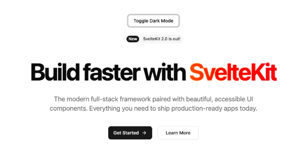
A couple of things worth noting here: text-muted-foreground is a Shadcn CSS variable class that automatically adjusts between light and dark mode — use these theme-aware classes instead of hardcoded colors like text-gray-500 wherever you can. And size="lg" is another Button prop that gives you a larger, more prominent CTA button.
The rest is up to you; add your own copy, images, animations, or whatever fits your project. Have fun with it!
Common Errors
Here are the most common issues people run into when setting up this stack — and exactly how to fix them.
❌ Cannot find module '$lib/components/ui/button'
Why it happens: You're importing a component that hasn't been added to your project yet, or the $lib path alias isn't resolving correctly.
Fix: Make sure you've run the add command for that specific component first:
If the alias is the issue, check that your svelte.config.js has kit.alias set — SvelteKit sets up $lib by default, so you usually won't need to touch this.
❌ Dark mode toggle isn't working
Why does it happen? ModeWatcher isn't mounted in the layout, or mode-watcher wasn't installed.
Fix: First, confirm the package is installed:
Then make sure <ModeWatcher /> is in your +layout.svelte file specifically — not just on a single page. It needs to be in the root layout so it applies across your whole app.
❌ ReferenceError: document is not defined
Why it happens: Some browser-only APIs (like document, window, or localStorage) are running during server-side rendering, where those globals don't exist.
Fix: Wrap browser-only code using SvelteKit's browser check:
Or use onMount, which only runs in the browser:
❌ Component props or events not behaving as expected
Why it happens: Svelte 5 introduced a new reactivity model using "runes" ($state, $props, $derived, etc.) that works differently from Svelte 4. Older tutorials and blog posts often show Svelte 4 syntax, which can cause confusion if you're on a fresh Svelte 5 install.
Fix: Make sure you're using consistent syntax for your Svelte version. If you set up your project recently with npx sv create, you're on Svelte 5. When in doubt, check the Svelte 5 docs or the migration guide.
Conclusion
You're all set! Here's a quick recap of everything we covered:
- Svelte and SvelteKit - a compile-time framework that produces fast, lean apps with a clean developer experience and file-based routing built in
- Shadcn-Svelte - a copy-paste component library that gives you full ownership of your UI code, no black boxes
- Project setup - getting both SvelteKit and Shadcn-Svelte initialized with just a handful of CLI commands
- Components - adding and composing Button and Accordion components in your pages
- Dark mode - enabling it with
mode-watcherin just a few lines of code - Common errors - the most frequent issues and their straightforward fixes
What I love about this stack is how fast you can build something that actually looks good. You're not fighting the framework; everything is designed to work together smoothly.
Reference Github Repo: https://github.com/themeselection/svelte-shadcn-template
From here, explore the full Shadcn-Svelte component library and start pulling in whatever your project needs: dialogs, forms, tooltips, data tables, and more. Every component follows the same pattern you've already learned here, so it'll feel immediately familiar.
You can use Shadcn Studio for your Svelte-based projects. It comes with
- Shadcn Blocks
- Shadcn Components
- Shadcn Templates
- Shadcn Builder
- Shadcn AI MCP
- Shadcn Figma Design System
- Shadcn Theme Generator
With Shadcn Studio, you can speed up your project easily.
Now go build something awesome. 🚀


.webp)
.webp)
.webp)
.webp)
.webp)
.webp)
.webp)
.webp)
.webp)
