


.svg)

.svg)


.svg)
.svg)

.webp)
CSS Grid has already transformed the way developers build layouts on the web. From simple two-column structures to complex responsive dashboards, Grid made layout control predictable and powerful. But as web interfaces continue to evolve, developers often need even more flexibility, especially when working with dynamic content, editorial layouts, and advanced placement logic.
This is where CSS Grid Lanes come in.
Recently introduced in WebKit’s experimental builds, CSS Grid Lanes aim to extend the Grid system by giving developers deeper control over how items flow and align across grid tracks. While still in preview, this feature signals an important step forward in modern CSS layout design.
In this article, we will explore what CSS Grid Lanes are, why they matter, how they differ from existing Grid features, and when developers can realistically start using them.
The Evolution of CSS Grid Lanes
Before understanding Grid Lanes, it helps to look at how CSS Grid evolved.
Initially, developers relied on floats, inline-block hacks, and later Flexbox for layouts. Flexbox worked well for one-dimensional layouts but struggled with complex grid-style structures. CSS Grid solved this by introducing a true two-dimensional layout system.
With Grid, developers gained:
- Precise row and column control
- Fractional units (fr)
- Named grid areas
- Auto placement system
- Responsive design without media query overload
Later, Subgrid improved nested grid alignment, making complex layouts more consistent. Now, Grid Lanes attempt to push flexibility even further.
What Are CSS Grid Lanes?
CSS Grid Lanes introduce a new way to control how grid items flow across rows and columns. Instead of strictly relying on traditional row/column placement, lanes provide an additional structural layer that allows better organization and predictable flow behavior.
In simple terms, Grid Lanes help define logical paths inside the grid where content can flow in a more structured way.
Think of lanes like invisible tracks that guide how items move through the grid.
This becomes especially useful in:
- Editorial layouts
- Dynamic content grids
- Magazine-style designs
- Complex responsive systems
Rather than manually controlling every row and column, developers can allow content to follow defined layout lanes automatically.
Ready to build your next website or web app? Start your project with Zignuts' expert web developers.
**Hire now**Hire Now**Hire Now**Hire now**Hire now

Why This Update Matters
CSS Grid Lanes may sound like a small addition, but the impact could be significant for real-world development.
1. Better Layout Control
Traditional Grid sometimes requires manual positioning when layouts become complex. Lanes allow developers to structure content flow more naturally, reducing manual placement.
2. Improved Handling of Dynamic Content
Modern websites often display unpredictable content such as:
- Blog cards
- Product grids
- Media galleries
- Dashboard widgets
Grid Lanes help manage these layouts more reliably without breaking alignment.
3. More Flexible Responsive Design
Responsive layouts often need content to reorganize intelligently. Grid Lanes provide a structured way to define how content should flow when the screen size changes.
4. Cleaner and More Maintainable CSS
Complex grid logic often leads to messy CSS. Lanes help simplify layout definitions, making code easier to maintain and scale.
Current Status of CSS Grid Lanes
CSS Grid Lanes are currently experimental and available in Safari Technology Preview through WebKit.
This means:
- Not yet production-ready
- Still under development
- Subject to change
- Not supported by all browsers
However, early implementation shows promising results, and it is likely that other browsers will begin exploring similar capabilities in the future.
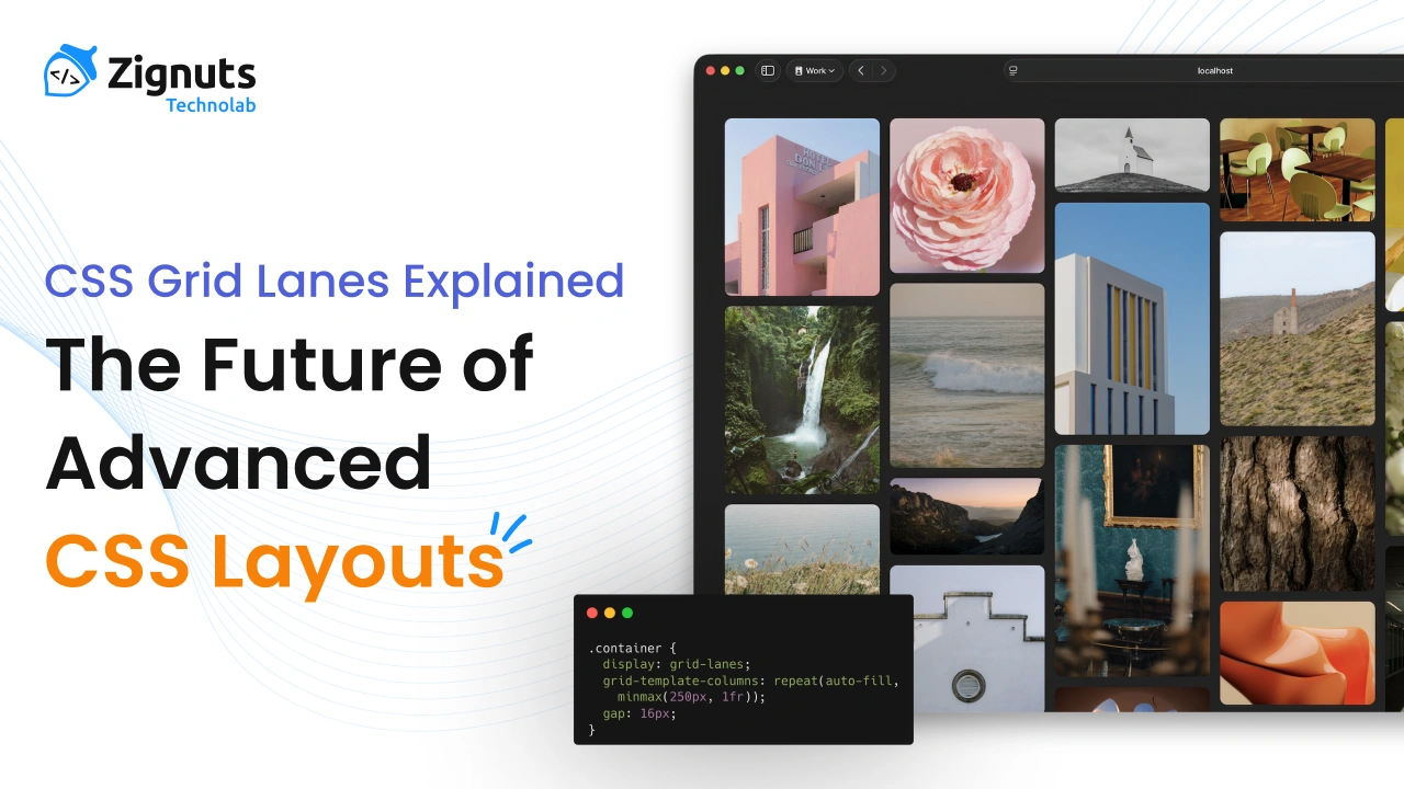
Basic Concept Example
Here is a simplified conceptual example of how Grid Lanes might be used.
In this idea, lanes define logical layout paths instead of forcing strict row/column placement.
While syntax may evolve, the concept focuses on structured content flow rather than manual positioning.
Grid Lanes vs Traditional Grid
Let’s compare how layouts behave with and without lanes.
Traditional CSS Grid
- Manual placement is often required
- Auto placement sometimes unpredictable
- Complex layouts need more CSS rules
- Dynamic content can break alignment
CSS Grid Lanes
- Logical layout flow
- Better auto placement behavior
- More predictable structure
- Cleaner CSS for complex designs
In essence, Grid Lanes extend Grid rather than replacing it.
Real-World Use Cases
1. Magazine-Style Layouts
News and editorial sites often use irregular layouts with featured content, side stories, and dynamic cards. Grid Lanes help maintain structure while allowing flexibility.
2. Masonry-Like Grids
Although Masonry layout is separate, Grid Lanes can assist in better organizing content flow across uneven grid structures.
3. Dashboard Interfaces
Admin dashboards often contain:
- Charts
- Cards
- Tables
- Notifications
Grid Lanes can define logical layout zones, improving scalability.
4. Content-Heavy Websites
Blogs, media galleries, and portfolio websites often deal with unpredictable content sizes. Lanes improve alignment and flow behavior.
Interaction with Subgrid
Subgrid solved nested alignment issues, but Grid Lanes focus on flow and structure rather than alignment.
Together, they could enable:
- Deeply structured layouts
- Consistent nested grids
- Predictable responsive behavior
- Cleaner layout architecture
This combination could significantly improve complex UI design systems.
Browser Support and Future Outlook
Currently:
- Available in Safari Technology Preview
- Not yet supported in Chrome or Firefox
- Experimental implementation
However, WebKit innovations often influence broader CSS standards. If Grid Lanes prove useful, other browser engines may adopt similar concepts.
Timeline expectations:
- Experimental phase now
- Possible early adoption in 1–2 years
- Wider browser support may take longer
For now, developers should monitor progress rather than use it in production.
Should Developers Start Using It?
Since Grid Lanes are experimental, they should not be used in live production websites yet. However, developers should start learning the concept because:
- It represents the future of CSS layout
- Helps prepare for upcoming layout systems
- Improves understanding of advanced Grid behavior
- Useful for experimentation and prototypes
Early adoption of layout concepts often gives developers an advantage.
Practical Learning Strategy
If you want to stay ahead:
- Learn advanced CSS Grid thoroughly
- Understand Subgrid behavior
- Follow WebKit and CSS Working Group updates
- Experiment with preview features
- Study modern layout patterns
By doing this, Grid Lanes will feel natural when officially released.
Performance Considerations
While still under development, layout systems like Grid Lanes are expected to be optimized by browser engines. Since they extend the Grid rather than adding heavy scripting logic, the performance impact should remain minimal.
However, real performance evaluation will only be possible once the feature reaches stable builds.
The Future of CSS Layout
CSS layout continues to evolve toward:
- More intelligent auto layout
- Better dynamic content handling
- Less manual positioning
- Cleaner and scalable CSS architecture
Grid Lanes fit perfectly into this direction. They represent another step toward making CSS layouts more flexible, logical, and developer-friendly.
As web design grows more complex, tools like Grid Lanes help maintain structure without sacrificing creativity.
Conclusion
CSS Grid has already transformed modern layout design, but CSS Grid Lanes could push it even further. By introducing structured layout flow and better content organization, this feature promises to simplify complex layouts and improve scalability.
Although still experimental and limited to Safari Technology Preview, Grid Lanes are worth watching closely. Developers who understand this concept early will be better prepared for the next evolution of CSS layout systems.
For now, treat Grid Lanes as a glimpse into the future of web design, experiment when possible, and continue building strong fundamentals in CSS Grid and responsive layout techniques.


.webp)
.webp)
.webp)

.png)
.png)
.webp)
.webp)
.webp)
