


.svg)

.svg)


.svg)
.svg)

.webp)
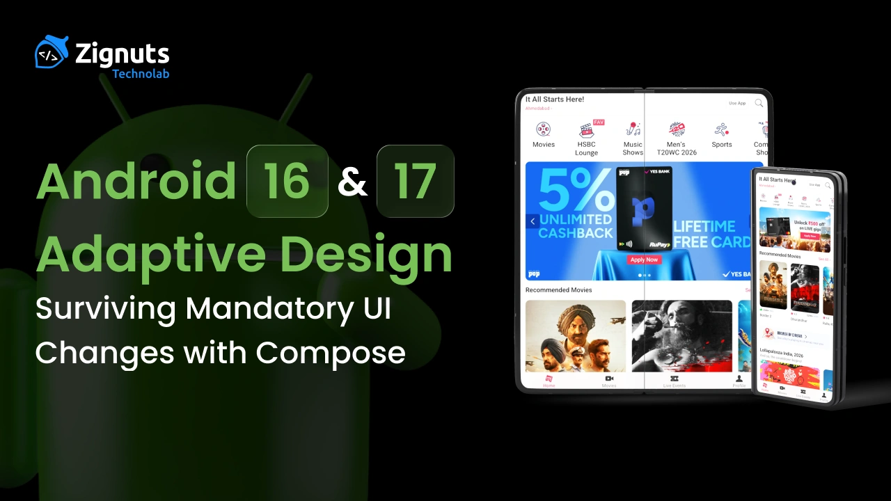
Android has been moving toward adaptive UI for nearly a decade, but Android 16 is the release where adaptive design stops being guidance and becomes enforced platform behavior, at least on large screens.
Android 17 builds directly on this shift, signaling the end of compatibility paths that allowed apps to avoid resizing, rotation, and window changes.
This article covers:
- What Android 16 explicitly enforces
- Which legacy UI controls are ignored by the system
- What still remains optional (for now)
- How Android 17 continues and hardens this direction
- How to build a correct adaptive UI using Jetpack Compose
- Practical code patterns you can ship today
1. The Platform Direction: From “Mobile-First” to “Window-First”
Older Android apps were built with an implicit assumption:
“The screen is a phone, portrait, and full-screen.”
Modern Android devices break that assumption:
- Foldables open and close dynamically
- Tablets rotate frequently
- Desktop and freeform modes resize windows arbitrarily
- Multi-window is common, not niche
Android 16 formalizes this reality by shifting authority away from app-level restrictions and toward system-controlled window behavior.
Ready to turn your app vision into a reality? Get started with Zignuts expert Android app developers.
**Hire now**Hire Now**Hire Now**Hire now**Hire now

2. Android 16: What Is Mandatory or System-Enforced
2.1 Orientation Locks Are Ignored on Large Screens
For apps targeting Android 16, the system ignores orientation requests on devices whose smallest width is ≥ 600dp.
This includes:
- android:screenOrientation
- setRequestedOrientation()
- getRequestedOrientation()
Important boundaries
- Phones (sw < 600dp): still allowed to respect orientation locks
- Games (android:appCategory="game"): exempt
Impact
Your app will rotate or resize on tablets and foldables, even if you attempt to prevent it.
2.2 Resizability and Aspect Ratio Limits Are Ignored
Android 16 also ignores:
- android:resizeableActivity="false"
- android:minAspectRatio
- android:maxAspectRatio
On large screens, your app:
- Can be resized
- Can enter multi-window
- Can be stretched beyond phone-like dimensions
If your layout assumes fixed sizes, Android 16 will expose that assumption.
2.3 Edge-to-Edge UI Is Enforced
Android 16 removes the ability to opt out of edge-to-edge system UI on Android 16 devices.
That means:
- Status bars and navigation bars may overlap content
- Gesture navigation is assumed
- Insets must be handled correctly
Hard-coded paddings like 24dp or 48dp are no longer safe.
2.4 Predictive Back Navigation Is Enabled by Default
Apps targeting Android 16 run with predictive back enabled by default.
If your app:
- Blocks back navigation
- Intercepts back incorrectly
- Relies on legacy back handling
You may see broken animations or inconsistent navigation behavior unless updated.
3. What Android 16 Does Not Force
Accuracy matters. Android 16 does not require you to:
- Rewrite your app in Jetpack Compose
- Build tablet-specific UIs for every screen
- Support every orientation on phones
- Implement multi-pane layouts everywhere
However, Android 16 removes the system’s obligation to honor your restrictions on large screens.
.png)
4. Why These Changes Matter Even for “Phone-Only” Apps
Foldables blur the line between phone and tablet:
- Inner screens often exceed 600dp
- Rotation and resizing happen during normal use
- Apps may resize without being recreated
ChromeOS and desktop modes:
- Allow freeform window resizing
- Expect mouse/keyboard support
- Break phone-centric assumptions quickly
If your app fails under these conditions, Android 16 will not shield you anymore.
5. Android 17: The Direction Gets Harder, Not Softer
While Android 17 details are still evolving, its trajectory is clear because it removes transitional compatibility paths introduced earlier.
5.1 No More “Adaptive Compatibility” Safety Nets
Android 16 is the release where:
- Restrictions are ignored
- Compatibility behaviors still exist in limited form
Android 17 is expected to:
- Remove remaining opt-outs
- Treat adaptive behavior as baseline correctness
In practice, this means:
- Orientation locks on large screens are not just ignored—they’re obsolete
- Non-resizable assumptions are no longer tolerated
- Desktop-style windowing becomes a first-class scenario
5.2 Desktop & Freeform Windowing Become Normal
Android 17 continues Google’s push toward:
- Large monitors
- Desktop-like workflows
- Multi-window productivity
Your app should assume:
- Arbitrary window sizes
- Frequent resizing
- Input beyond touch (mouse, keyboard)
5.3 Adaptive UI Is No Longer “Large Screen Only”
Android 16 draws the enforcement line at sw ≥ 600dp.
Android 17 pushes developers toward window-based adaptation, not device-based logic.
That means:
Respond to available space, not device category.
6. Adaptive Design: The Correct Mental Model
Adaptive design in Android 16+ means:
“My UI responds to window size, orientation, and insets dynamically, without relying on fixed assumptions.”
This is about functional correctness, not polish.
7. Jetpack Compose: Built for This Shift
Jetpack Compose is not mandatory—but it naturally aligns with Android 16 and Android 17 expectations.
7.1 Use Window Size Classes, Not Orientation
This approach:
- Handles rotation
- Handles resizing
- Works across foldables and desktop modes
7.2 Avoid Fixed Dimensions
Bad:
Modifier.width(360.dp).height(640.dp)
Good:
Modifier.fillMaxSize().padding(16.dp)
Android 16+ assumes layouts scale fluidly.
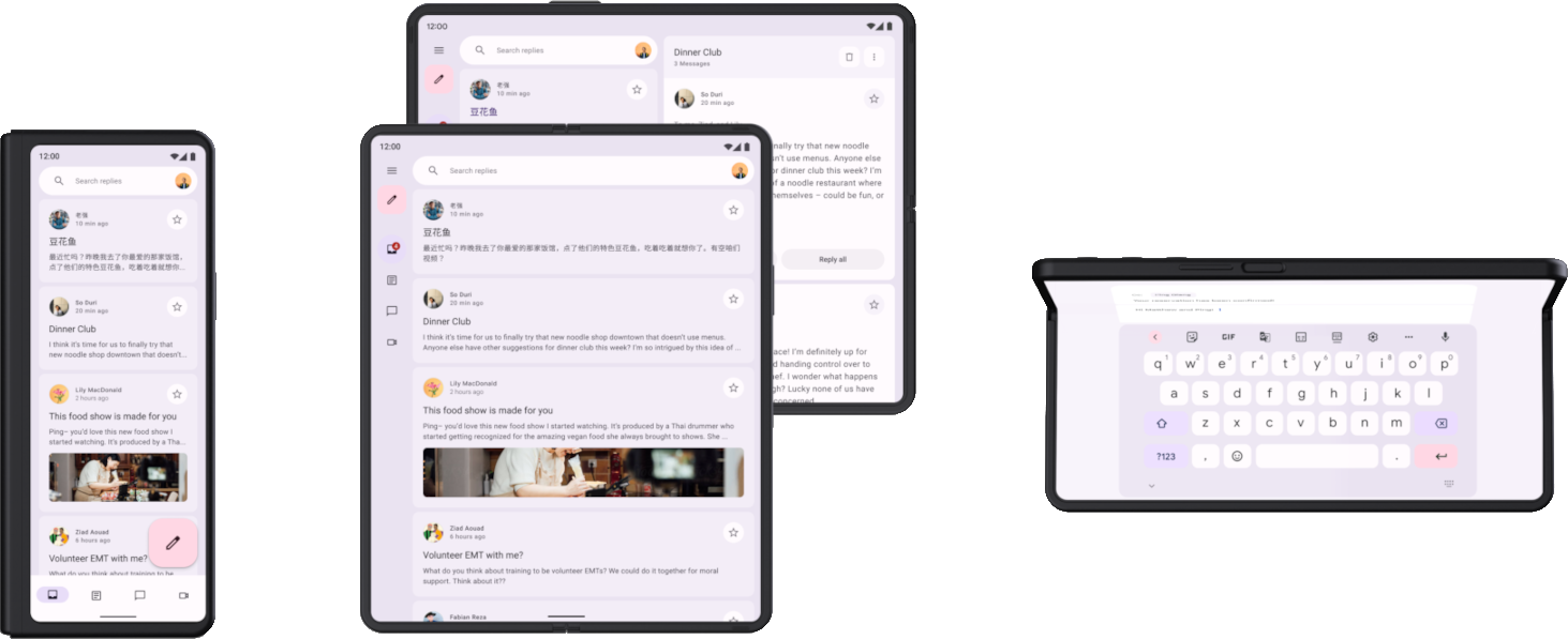
8. Two-Pane Layouts for Large Screens
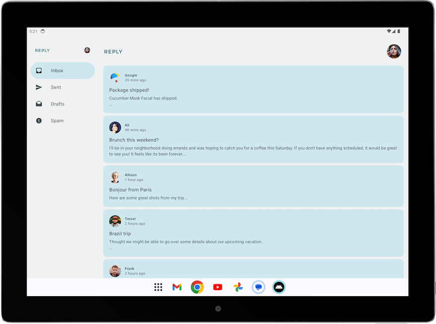
Two-pane layouts are not mandatory—but they are the cleanest way to avoid wasted space.
.png)
Ready to build a high-quality mobile app? Start your project with Zignuts' expert mobile developers today.
**Hire now**Hire Now**Hire Now**Hire now**Hire now
9. Edge-to-Edge UI in Compose (Mandatory)
Avoid hard-coded system padding. Insets vary across devices.
10. Configuration Changes Are Now Frequent
Android 16+ triggers configuration changes for:
- Rotation
- Resize
- Fold/unfold
- Desktop transitions
10.1 Save UI State
10.2 Use ViewModels for Long-Lived State
11. Preserve Scroll, Focus, and Input
Losing scroll or input during resize feels like a bug—not a limitation.
12. Orientation-Aware Layout Without Locking Orientation
This respects UX intent without fighting the system.
13. Navigation 3 & Two-Pane Strategy: Building Adaptive Navigation with Scenes
Navigation 3 is built from the ground up for Jetpack Compose, and one of its core strengths is native support for adaptive layouts. Unlike the previous Navigation component (Nav2), Navigation 3 lets your UI display multiple destinations simultaneously — crucial for modern large screens, foldables, and two-pane designs. Android Developers
Why Scenes Matter
In Navigation 3, the fundamental unit for rendering UI is a Scene. A Scene can render one or more navigation entries (NavEntry). This makes it possible to construct layouts that display, for example:
- a list and a detail view side-by-side
- a master pane with persistent navigation
- a bottom sheet plus primary content
—all while still integrating with the navigation back stack. Android Developers
Here’s how Navigation 3’s Scene model works:
- Scene: Represents a visual state with one or more entries.
- SceneStrategy: Decides how to map a navigation back stack to a Scene based on criteria like window size or number of entries.
- NavDisplay: Observes the back stack and uses a SceneStrategy to determine which Scene to render. Android Developers
Core Concepts for Two-Pane Navigation
In a two-pane UI, your goal is:
- On compact screens (phones) → show only the list; navigating to item details replaces the list.
- On expanded screens (tablets/foldables/desktop) → show list + detail simultaneously.
Navigation 3 enables this by letting a SceneStrategy group entries into a single Scene with multiple panes.
Dependencies
Make sure you have the Navigation 3 and adaptive UI artifacts:
Step 1: Define Navigation Keys
In Navigation 3, you define keys for each screen — these drive what content can appear in a Scene.
sealed interface NavKey
object NotesListKey : NavKey
data class NoteDetailKey(val noteId: String) : NavKey
Step 2: Create a List-Detail SceneStrategy
A custom SceneStrategy inspects the back stack to decide whether to render one pane or two panes.
This SceneStrategy maps multiple NavEntrys (list and optional detail) into one composable layout. Android Developers
Step 3: Build the Two-Pane Composable
Next, render the list and detail panes in one layout, adapting to screen width:
This pattern:
- Shows list + detail side-by-side on expanded screens
- Falls back to single-pane navigation on compact screens
Step 4: Display with NavDisplay
Use NavDisplay to connect your back stack to the UI via the strategy:
- rememberNavBackStack() holds your navigation state
- sceneStrategy decides what layout to render
- NavDisplay composes the UI
This approach avoids a traditional NavHost and gives direct control over navigation state and layout, which is crucial for adaptive two-pane UX. Android Developers
Integrating With ViewModels and State
Each screen can still have a ViewModel scoped to the navigation entry:
This keeps UI logic and navigation separate but coordinated.
14. Testing Checklist for Android 16 & 17
Before shipping, test:
- Foldable (open ↔ folded)
- Tablet (sw ≥ 600dp)
- Split-screen
- Freeform resize
- Gesture navigation
- Font scale ≥ 1.3×
If UI overlaps, resets state, or clips—fix it now.


.webp)
.webp)
.webp)
.webp)
.webp)
.webp)
.png)
.png)
